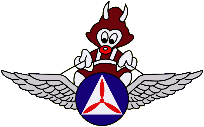
 The Minnesota Wing Gremlin by Major Andrew "Ace" Browning, CAP Historian View the PDF presentation. |

In the early 1980s, a few wings in the North Central Region unsuccessfully attempted to standardize their patches to match the region shoulder arc.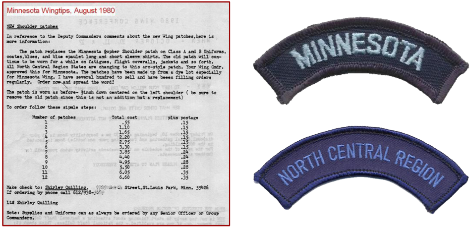

 This is the original manufacturer's stich-out proof of the third Minnesota Wing patch. It was received by wing headquarters in October 2023 from Colonel Erica R Williams, North Central Region Deputy Chief of Staff (DCS ET), who had received it from Civil Air Patrol's official insignia manufacturer Vanguard Industries Inc in Norfolk, VA.
Since the proof was approved without change, it has little distinction from the first production run of patches available to CAP membership. The proof has a lighter shade of yellow, whereas the production patches have a color closer to Air Force yellow or gold. There is a unique manufacturer's sticker heat-sealed into the back [PHOTO] which does not appear on the production patches.
The emblem was designed by Major Ronald "Ron" C Finger of Crow Wing Composite Squadron and the CAP National Artist on February 13, 2022. It was approved by Colonel William "Bill" Hienz, Minnesota Wing Commander, and Colonel John R. O'Neill, North Central Region Commander. The emblem was authorized for use by Major General Edward "Ed" D Phelka, Civil Air Patrol National Commander in early 2023. The new emblem was officially unveiled to the membership on April 22, 2023, during the Minnesota Wing Conference at Cragun's Resort in Brainerd, MN.
Information provided by:
Col Jason W Suby, Commmander, Minnesota Wing
May 9, 2024

 "Wing AEO's Get New Patch"
by Major Dan McDowell
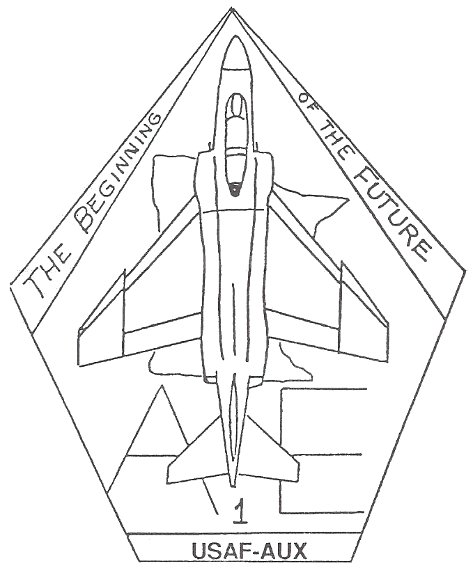
As a part of the New Spirit '89-'90 program, all Wing Aerospace Education Officers have a new patch that they may wear which will identify them as one of the few, the proud, the devoted, the Wing Aerospace Education Officer. The patch, shown [at right], is designed with the mission of the Aerospace Education program and the spirit of America in mind.
The colors represent the United States. The red represents the blood shed by the many aerospace pioneers, test pilots and others who believed and fought for the advancement of aerospace. The dark blue represents the ocean of air and space; the realm of flight. The white represents the purity and freedom of this land, which is so freely felt as we dwell in the vastness of the aerospace environs. The gold represents the riches we have in our lives because of what aerospace and its technology have given us as well as the gifts of those who have sacrificed so much in the quest to improve and enrich our lives.
The F-4 aircraft was chosen for the patch because it represents an aerospace past, present and future. A backbone of the Air Force inventory for almost 30 years, it is still in extensive service to America and the world today. It is, also, the aircraft currently in use by the Minnesota Air National Guard in Duluth and is represented at the Air Museum at the Air National Guard Base in Minneapolis.
The map of Minnesota identifies the wearer as a member of the Minnesota AE team. The number "1" at the bottom of the patch shows the AE programs's desire to share in the Wing's effort to be the best in all we do.
The patch is authorized to be worn by Wing Aerospace Education Officers only in the same manner that other emergency service and special qualification patches are worn. For further information, contact the Wing Aerospace Education Officer (Wg/AE) at Wing Headquarters.
-
Originally printed in the December 1989 issue of WINGTIPS, Minnesota Wing's official monthly newsletter.
-

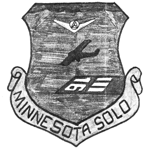
After previously having been held in Manakto, MN, the Minnesota Wing Solo Encampment was moved to Grand Rapids, MN in 1986. A member of the '86 class, C/Capt Jay Sliwinski, created an emblem design to be worn as a pocket patch by all future Solo Encampment graduates. Runway 16/34 at Grand Rapids-Itasca County Airport (GPZ) is represented in the design.
Due to problems with the facilities in Grand Rapids, Solo Encampment was moved back to Mankato the following year. The 1987 class was awarded the patch as were subssequent classes until at least 1991. Since the nearby Waseca Municipal Airport (ACQ) that the encampment utilized had a runway numbered 15/33, graduates would alter their patches with black marker or black thread to change the "16" into a "15".
As the encampment continued to be located in the Mankato area, a smaller-sized version of the patch with an updated runway number is said to have been produced sometime in the mid-1990s.
Information provided by:
Lt Col Jay Sliwinski
November 9, 2016

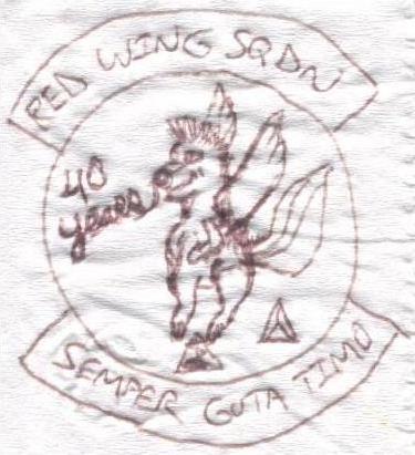
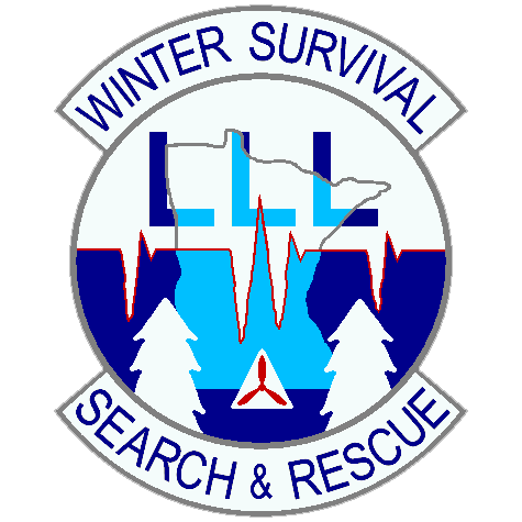 The emblem's colors are cold - white, gray, dark blue and light blue - representing the harsh winter elements that students of Minnesota Wing's Winter Survival School will have to face.
The disk is divided in two colors: Argent (White, #FFFFFF) on top representing the selfless virtues that a Civil Air Patrol volunteer has to help others in peril. Azure (Dark Blue, #00008B) on bottom representing the dedication of a Civil Air Patrol volunteer to the Emergency Services mission. This is also the color of Civil Air Patrol's Search and Rescue Award insignia.
The disk's horizontal divisional is an Electrocardiogram (EKG) line, symbolizing the importance of the school's students learning to maintain their physical and mental health in a survival situation. The heartbeats are Gules (Red, #C80000) representing the strength and vigor students must put forth to overcome many challenges to graduate from the school. The heartbeats also form three groups of icicles: a single one on the left, a pair in the middle, then a single one on the right. The icicles pay homage to Hutchinson Composite Squadron (MN-121) which started the Winter Survival school in 2003.
At the top of the disk, the letter "L" three times in a row is the ground-to-air communications signal for "Mission Accomplished".
The school is a Minnesota Wing activity. The map of Minnesota in the center of the disk identifies this, and encompasses the many training locations and students the school serves. The map is Light Azure (Deep Sky Blue, #00BFFF) representing the sky and Civil Air Patrol as an aviation-based organization.
The two snow covered pine trees at the disk's base symbolize the skills students learn to use in a survival situation. Many of these skills have to do with knowing how to take advantage of what nature provides in order to meet basic human necessities.
Centered at the bottom of the disk is a red tri-prop inside a white triangle, which is original Civil Air Patrol organizational emblem.
The curriculum of the school is on the two tabs: "WINTER SURVIVAL" on top, and "SEARCH & RESCUE" on the bottom. A Gray (#808080) border encompasses the emblem, representing the professionalism and dependability of trained Civil Air Patrol search & rescue personnel.
The Winter Survival School emblem was designed by Major Andrew "Ace" Browning of Red Wing Composite Squadron, at the request of the school's commander Lieutenant Colonel Chet Wilberg of Minnesota Wing Headquarters. The design was approved by Director of Emergency Services Major Paul Pieper, and authorized for wear as a patch by Minnesota Wing Commander Colonel Thomas B Theis on October 29, 2010. [Authorization Document] Patches were first awarded to staff and students completing the school held January 07-09, 2011 near Lake George, Minnesota.
Information provided by:
Maj Ace Browning, MN-104 Historian
October 29, 2010

 The central shield resembles the AETC shield and signifies the link to the educational foundation of the CTG, and pays homage to the Air Force of which we are the auxiliary of. The emblem resembles that of the California Wing Encampment, just as our encampment environment now resembles theirs. The shield is blue, to signify loyalty to the Air Force, and those in the Civil Air Patrol.
The Civil Air Patrol three-blade propeller is in the center of the shield, showing the central role of CAP. The blue of the shield represents charity, as we are all volunteers and are giving up our time in the hope of developing one's self. The red three-blade propeller represents the three missions of CAP, and it's long history of service to our nation.
The torch under the CAP shield represents how the cadet staff and seniors pass the torch of leadership to the next generation. Its location serves as the foundation for the CAP shield, just as encampment serves as a foundation for the cadet program. The yellow in the torch represents excellence and honor, the red flame represents courage, and the orange flame represents ambition, since all are required to complete the program.
The Insignia is set on a black background, which represents determination, which is needed to both create, and complete this level of training. The gray border represents maturity, because the CTG is the foundational step in the cadet program. Once completed, graduates assume higher levels of responsibility and have new opportunities open to them. Minnesota is written across the top in gray, to show our link to where we are. The blue banner at the bottom of the patch is to remember all of the locations that have hosted encampment in the past, and the charity that has been received by those hosts.
The emblem represents the CTG, who we where, are, and will be.
Information provided by:
1st Lt Andrew Dew, MN-122
Patch Designer

 The blue within the shield and the yellow around it represent the colors and history of the Minnesota Wing as well as the emblem that represents the wing. The blue within the shield also represents our loyalty to the Air Force, which we are the auxiliary of, and Civil Air Patrol.
The black outline around the yellow of the shield represents the determination needed to both create and complete the level of training that the Cadet Training Group sets before us.
The white within the banner on the bottom represents the purity of the vision of the Cadet Training Group to create leaders for the future. The banner represents the significance of the Eighth Cadet Training Group.
The area beneath the eight represents the location that has hosted the Cadet Training Group. The red signifies the support that has been given to our organization by the host whose home unit is the 34th Infantry Division which is represent by the emblem of a red bull.
 The eight not only represents the significance of the eighth Cadet Training Group but also pays respect to the Eighth Air Force and the people who have served within it, which will be celebrating 65 years of loyal service to our nation after being birthed under supervision of the United States Army as the United States Army Air Force. This in turn pays respect to the United States Army National Guard for their support to host the Cadet Training Group within their facilities.
The red three blade propeller within the white triangle is centered on the emblem within the lower loop of the eight to represent the central roll of Civil Air Patrol and its history of loyal service to our nation. The red three blade propeller represents the three missions of Civil Air Patrol, Emergency Services, Cadet Programs and Aerospace Education.
This emblem represents the Cadet Training Group and Civil Air Patrol. Who we were, what we are and where we will be.
Information provided by:
Capt Conrad Peterson, Minnesota Wing Headquarters
Patch Designer

The Double-headed Eagle emblem...
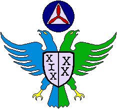 Eagles are strong, intelligent and resourceful; as well as a symbol of American patriotism. These are characteristics instilled into all 10th Cadet Training Group personnel.
The Eagle's left side is Aquamarine, the precious gemstone of a 19th commemoration, and symbolizes the 19th Cadet Training Squadron. 'XIX' on the left side of the small Silver shield is the Roman numeral 19.
The Eagles right side is Emerald, the precious gemstone of a 20th commemoration, and symbolizes the 20th Cadet Training Squadron. 'XX' on the right side of the small Silver shield is the Roman numeral 20.
With the two Squadrons together and the Double-headed Eagle whole, the heads and talons form the shape of an 'X' which is the Roman numeral 10 and represents the Group.
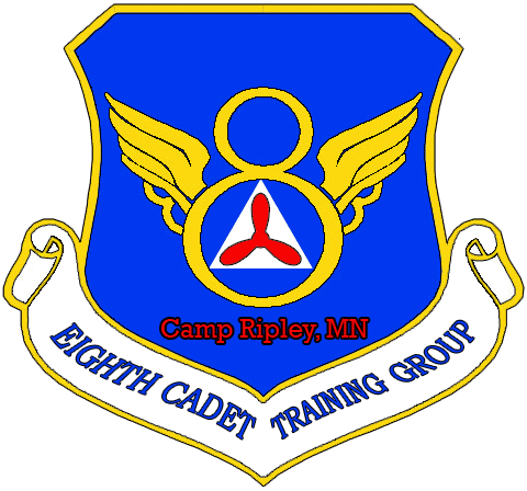
Above the Eagle is the traditional symbol of the Civil Air Patrol, the Red Tri-prop with a White (Silver) Civil Defense Triangle on a Blue background. The Eagle is surrounded by a map of Minnesota.
 The Blue, Gold and Red horizontal sections in the field behind the Eagle, as well as the Black edges are from Camp Ripley's own 175th Readiness Training Instruction (RTI) unit patch. They indicate the 10th CTG's respect and gratitude for their support of the Minnesota Wing Encampment and the Civil Air Patrol.
The scroll beneath the field identifies the 10th Cadet Training Group, and displays the Silver and Blue colors of Civil Air Patrol's parent organization, the United States Air Force.
The Double-headed Eagle emblem of the 10th Cadet Training Group was conceived and designed in February 2008 by Major Conrad Peterson of Minnesota Wing Headquarters, and Major Andrew "Ace" Browning of Red Wing Composite Squadron. It was approved and authorized by Lieutenant Colonel Douglas Kilian, Director of Cadet Programs, and Colonel Steven Miller, Minnesota Wing Commander.

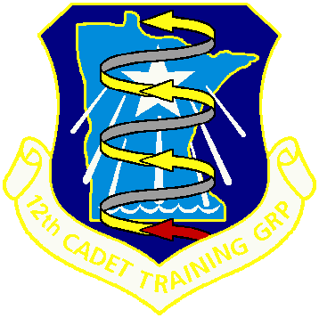 A running theme of the Integrated Leadership Program (ILP) is the Upward Spiral. Cadets return to encampment each year, achieving higher and higher levels of development. The bottom and first arrow represents the encampment's basic students, and the beginning of their climb through the cadet program.
"Pride in Passion" is a theme that 12th CTG Commander, Cadet Lieutenant Colonel Billy R Hoffman, is using to inspire cadets to always be passionate about the work they are doing. Red is the color of Passion. The four arrows in the ILP Upward Spiral signify the four phases within the Civil Air Patrol Cadet Program. Yellow is the color of Excellence, and Gray is the color of Maturity.
 The Minnesota National Guard Joint Force Headquarters is a joint Army and Air National Guard command headquartered in St Paul. JFHQ-MN provides personnel, intelligence, operations, logistics, and resource guidance and support to the Major Commands in the Minnesota National Guard. JFHQ-MN also coordinates military support at the request of the Governor in the event of a disaster and is capable of providing a joint command staff for federal military forces operating within the State of Minnesota.
The light blue and white shoulder sleeve insignia (SSI) of the JFHQ-MN stands behind the ILP Upward Spiral, representing our gratitude of the Camp Ripley training facility staff, and the Minnesota National Guard's support of the Cadet Encampment and Civil Air Patrol.
The Yellow outline of the State of Minnesota, as well as the Blue background of the shield, reflect the colors of the Minnesota Wing shoulder patch, and Minnesota Wing's support of the Cadet Encampment.
The emblem of the 12th Cadet Training Group was designed in April 2010 by Major Andrew "Ace" Browning of Red Wing Composite Squadron, at the request of the 2010 Cadet Encampment Commander, Captain Nash Pherson of Mankato Composite Squadron. The design was approved on May 5 by Captain Pherson's staff, and Major Janelle Gates, Director of Cadet Programs. It was authorized as a wearable patch on May 18 by Colonel Thomas B Theis, Minnesota Wing Commander.

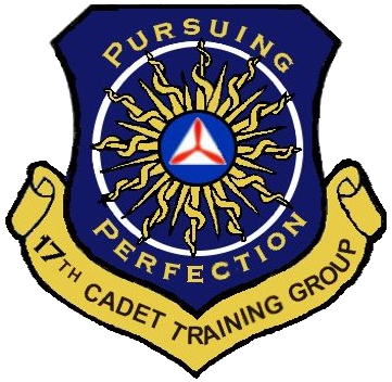 "Pursuing Perfection" will be the 17th CTG motto.
"Pursuing Perfection" encompasses an extremely important CAP Core Value and motivates cadets to always be looking for ways to improve themselves from who they were yesterday to whom they can become.
The Civil Air Patrol symbol in the middle represents the foundation of the Core Values the program ingrains within its members.
The sun in the back represents how these values extend to all other parts of a CAP cadet's life as they become the leaders of tomorrow.
Lastly, the white circle surrounding the sun represents the exquisite shine of excellence that every member of the 17th Cadet Training Group will possess at graduation and carry with them the rest of their lives.
Information provided by:
C/Lt Col Katherine Grotte, 17th CTG Commander
September 11, 2015

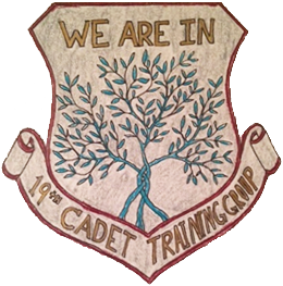 Moto: "We Are In"
Meaning:
The word "In" stands for 3 things- Incremental, Intentional, and Inspiring. The theme of encampment, starting from the CTW to day 8 will be improving as leaders, from staff to all students, no matter your place in the cadet program. The three words above describe how this change and development in our leadership should be. We choose to improve something and work on it every day (intentional). We accept that it won't happen over night, but with day to day monitoring (incremental), and in the end the change should be noticeable for the better and encourage others to follow along (inspiring).
Meaning of Items on Patch:
Plant - The growth in leadership/character
3 branches - Intentional, Incremental, Inspiring
Words - We are all in this tough pursuit of development together
Colors:
Green Plant - Freshness, Life (living to the fullest and bettering ourselves through it all)
Gold Lettering - Excellence and Wisdom (how we govern ourselves in this process) Grey Background- Retrospective (the actual act we are striving for that encompasses it all)
Red Rim - Strength (pushing us to follow through and do are best in everything we set out to accomplish)
Information provided by:
Lt Col Jay Sliwinski, 2017 Encampment Commander
March 17, 2017

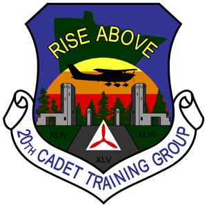 Motto: Rise Above. Rise Above exemplifies what it means to be a Civil Air Patrol cadet. As a team, we Rise Above our challenges no matter if we face physical, mental, or emotional adversity. Our core value of excellence drives us to Rise Above expectations and never allow "good enough" to dictate our standards for operation. Lastly, we literally Rise Above the earth as we take to the skies in Civil Air Patrol aircraft to fulfill our missions of Aerospace Education and Emergency Services.
Leadership Focus: Envision, Engage, Inspire. As growing young adults, we are faced with the reality of deciding where we want to go with our lives. Civil Air Patrol and similar organizations provide us with many open doors each bursting with its own unique opportunities. Now is the time to dream big, Envision where we want to go in life, and decide which doors you will walk through. With your decisions made, it's time to Engage in your vision and work hard to earn your way from one opportunity to the next. As you accomplish your goals and get closer to your vision, give back to those who helped you on your journey and Inspire others to pursue their dreams too.
Patch: Concept by C/LtCol Joe Taylor (CTG/CC), design by Major Andrew "Ace" Browning. The road, buildings, and trees represent Camp Ripley. The sun rising behind the trees has three colors: The red base represents the untamed energy for a dream which must be refined into a vision. The orange center stands for the determination required to engage and fulfill a vision. At the top, the yellow reminds us to light the way for others and inspire them to achieve their goals and vision. The airplane silhouette rises above Camp Ripley as recognition to the motto and our mission of Aerospace Education. The foreground, trees, and state of Minnesota are all shaded green to stand for our mission of Emergency Services.

 The lighthouse symbolizes how leaders shine bright in the world, leading others and providing guidance and direction even through difficult times. It also signifies the central guiding role that the Cadet Training Group (CTG) has over both the Advanced Leadership Course (ALC) and the Basic Leadership Course (BLC). Finally, it signifies the strong imagery of how the CTG unites both schools.
In the cream stripe of the lighthouse is where the Civil Air Patrol is prop is located. This prop represents the identity of this Encampment with the Civil Air Patrol and its three missions by boldly being placed in the center of the patch.
Coming out of the lighthouse are two beacons of light made of two different colors. Each one signifies reaching out and overarching to BLC and ALC while showering them in the same light to show the significance of both schools under the CTG. These beacons are made out of two different colors to signify the importance of two-way communication and the connection between both the upper and lower levels of leadership in any situation.
The diamond window of the lighthouse represents toughness and persistence, symbolizing the nature of leadership that is gained and formed over time, just like a diamond. The four points of the diamond also represent the four core values of Integrity, Volunteer Service, Excellence, and Respect which are key in forming leaders and followers.
The star centered above the lighthouse represents the state of Minnesota via the state motto "L�Etoile du Nord," which translates to "The Star of the North." It also symbolizes guidance and direction, which our students at Encampment receive throughout the duration of Encampment.
The mountains behind the lighthouse symbolize the challenges and obstacles that our students will face while also highlighting and celebrating the problems they will overcome with their teams.
The dark blue water symbolizes the nickname of Minnesota as "the Land of Many Lakes" while also enhancing the lighthouse imagery due to the nature and guidance of lighthouses.
Information provided by:
C/Lt Col Klara Rhudy, 27th Cadet Training Group Commander
March 26, 2025

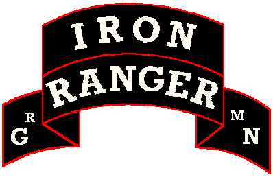 "Over the past nine or ten years since the beginning of the Iron Ranger patch, it has taken a few different forms. It actually started off being a patch designating the completion of a summer and/or winter survival/leadership school hosted by Grand Rapids. In the lower left part of the scroll, an "S" was for the completion of the week long summer course and in the lower right there was a "W" for completion of the winter encampment."
"Then in the mid 1990's it changed to say "GR" in the lower left and "MN" in the lower right which we had written authorization from the previous wing commander to wear on our right shoulder and with this variation the white letters may have been gold on a select few cadets that were trained above and beyond the training necessary for regular ground team operations and continued their education in woodsmenship, survival, advanced navigation, search techniques, leadership and were the cadre for the survival schools. Now with the new beginning of the cadet program in Grand Rapids, we have once again changed our patch to encompass the cadets that are not only from Grand Rapids. The change that was made is we took the GR and the MN from the lower parts of the scroll and replaced them with "MN" and "010" which is our unit."
Information provided by:
1st Lt Bruce Windorski
Grand Rapids Composite Squadron
October 27, 2004

 Black Forest Trees
Represent the Northern Minnesota area.
White Full Moon(s)
Represent the new moon, the new beginning of the Squadron.
13 White Stars
Represent the original colonies of the United States of America.
White Triangle & Red Three-bladed Propeller
These comprise the basic Civil Air Patrol logo.
The Color Red
Symbolizes the blood and tears put into building a life in the wilderness of Northern Minnesota by the pioneers.
"Minnesota Iron Rangers"
A longtime nickname of squadron members and refers to the iron-ore mining industry within the area.
Shape
Emblems representing a squadron-level echelon of the United States Air Force or Civil Air Patrol are contained in a disk shape.
Emblem approved by Col Bill Hienz, Minnesota Wing Commander, and authorized by Col John O'Neill, North Central Region Commander on November 18, 2022.
Information provided by:
1st Lt James (Jim) Owens, Commander
Grand Rapids Composite Squadron
March 9, 2022

 x
x
x
x
x
x
x
x
x
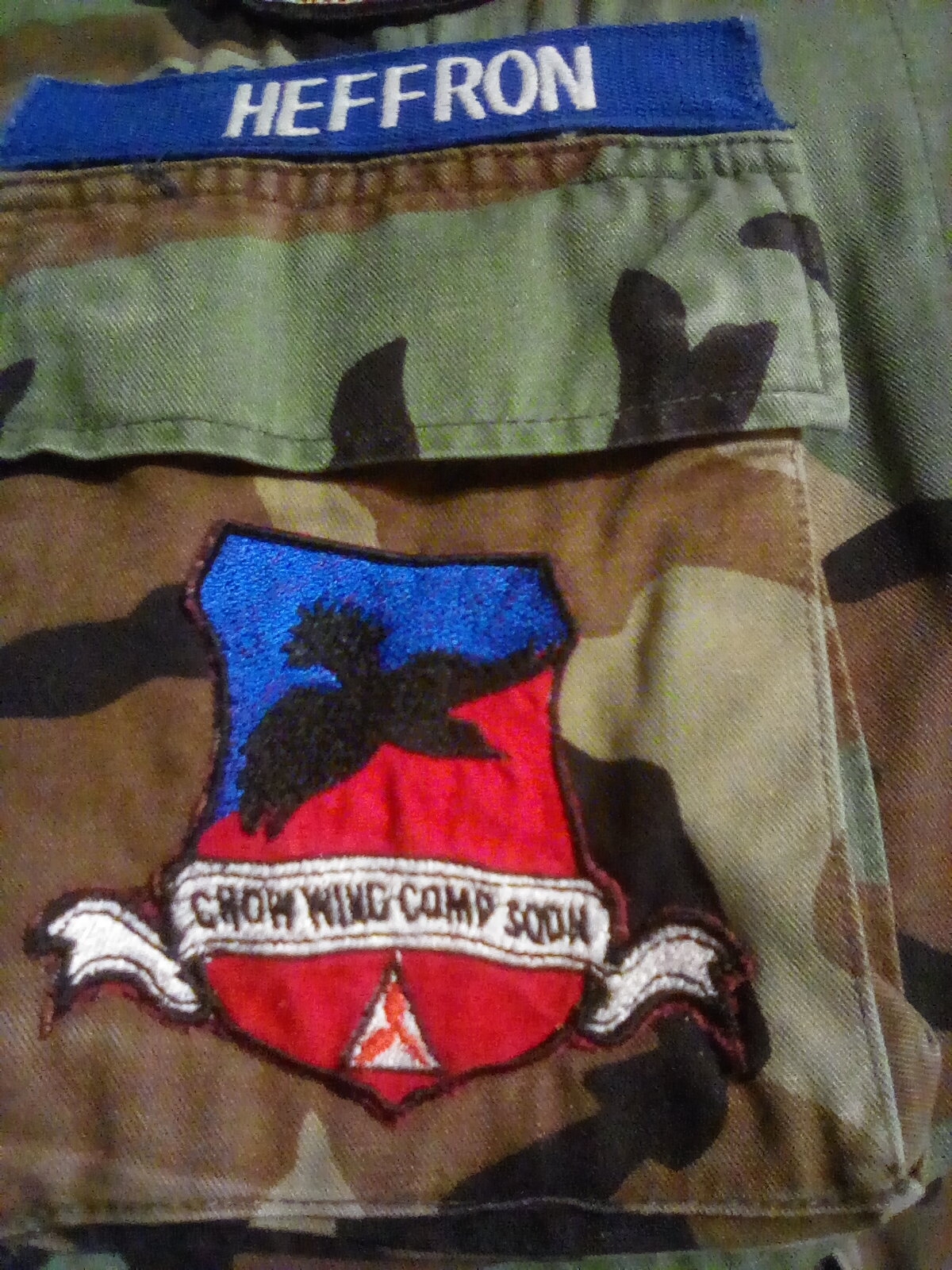
Information provided by:
Major Matthew Heffron, CAP
Crow Wing Composite Squadron
October 23, 2022

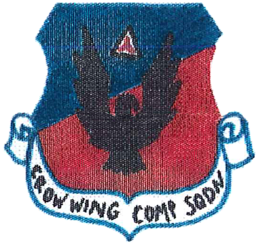
History
The patch was designed by squadron member, Major Ron Finger, and requested [proposal letter] for approval by Captain Cindy McCarthy, Squadron Commander, on 13 August 2018. It was authorized for use by Colonel James Garlough, Minnesota Wing Commander, on 26 September 2018.
Heraldry
COLORS: The colors have been slightly adjusted from the originally approved design. This is to better coordinate with the colors of both the BDU and ABU uniforms.
SYMBOLISM: The proposed design incorporates elements of our historical patches, with MNWG approvals for those patches beginning in the 1990s as nearly as we have been able to
discern.
- The blue background, rendered in the upper left portion of an angle from left to right, represent the waters of the Brainerd Lakes Area, including the many lakes and the rivers which flow into the Mississippi River. Blue is also representative of our aerospace mission and the blue skies.
- The red background, rendered on the lower right portion of the left to right angle, represents the red soil which is prevalent in our area. Red is also representative of our emergency services mission, especially our commitment to ground team training since our inception in the early 1950s.
- The black crow, the squadron mascot, is positioned as flying upward to the bearer's right. The crow, known for its intelligence and ability to adapt, is also symbolic of the mission of cadet programs. The name 'Crow Wing' is from our county name, with origins back to the nineteenth century. It is fitting that our mascot is centered on the disc since our members reside in several surrounding counties, but meet in the "heart" of the area, Crow Wing.
- Above the mascot to its right on the blue field, is the Civil Air Patrol logo. This reminds us that our missions come above all else. The logo, with the elements of the historical Civil Defense logo, also remind us of the early CAP Brainerd Squadron which active in the late 1940s and part of our rich history.
Information provided by:
Captain Cindy McCarthy, CAP
Former Commander, Crow Wing Composite Squadron
October 23, 2022

 COLORS
SYMBOLS
The patch design was authorized by Minnesota Wing Commander, Col Kevin F Sliwinski, on February 6, 2000.
Information provided by:
Lt Col Keith M Bischoff, MN-016 Commander
August 15, 2000

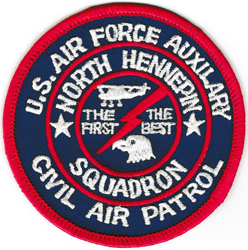
"I was in North Hennepin Composite Squadron from 1983-1986 as a cadet (ages 13-16) and went as high in rank as the Billy Mitchell award (which gave me E-2 when I joined the Army Reserve at 17). I was so surprised this morning when I saw this patch on your website (which I found while googling CAP...on a whim: I havent even thought about CAP in 20 years!). I am holding in my hand the same exact patch. You see, I "was there" when this patch came about."
"Anyway, a cadet of our squadron who joined with his girlfriend, and was only with us for a short time (I'm very sorry, but his name is lost to history) had his mom(!) make about 20 of these patches at her work. I believe he was inspired by seeing other squdrons in our Wing who had their own patches, but our Squadron, the first composite squadron in CAP history, didn't have one. He handed them out for free, I believe, to all the cadets at the squadron. By the next Tuesday, we were all wearing them. This patch was made, as I recall, just before the summer of 1984 - because I was wearing it proudly in photos that I have of the Wing Encampment to Grand Forks Air Force Base that summer."
"So it dates from 1984. Only us cadets wore it, not seniors, and I don't think we were given any special "permission" to put it on, nor was I ever told that it was authorized, but we all wore it anyway. I think it went out of use on the cadet uniform at our Squadron after I left CAP because there were only a limited number made. So that's the story... A rare collector's item indeed!"
Information provided by:
Mark Lovmo, former MN-017 cadet
August 08, 2007
(Ace's Note: Lt Col Dick Johnson (deceased), a squadron member since 1967, did not recall this patch having ever being used.)

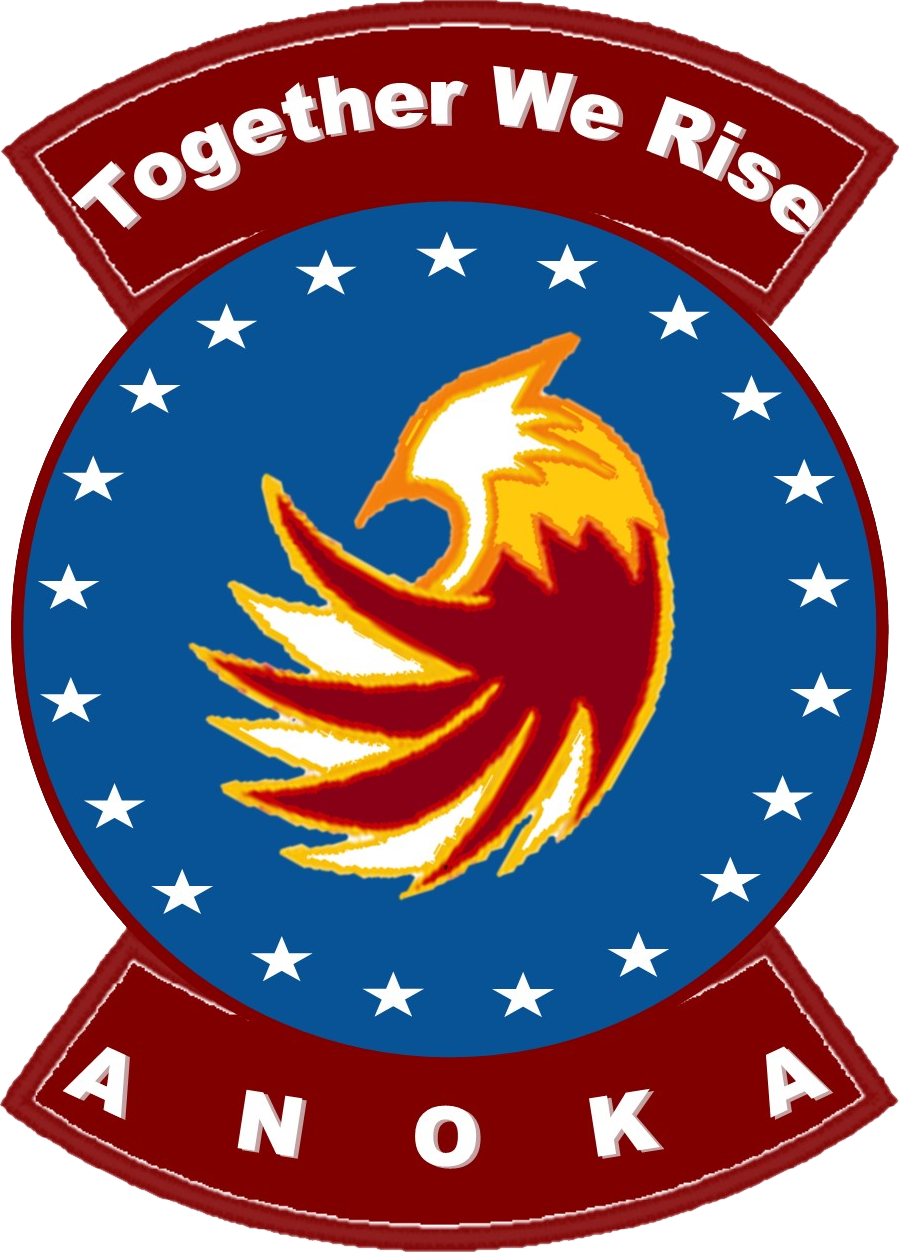
Description/Blazon
- On a blue disc, an outlined phoenix is surrounded by 21 stars, edged in maroon.
- Attached below the disc, a maroon scroll edged with a narrow maroon border and inscribed
"Anoka" in white letters.
- Attached above the disc, a maroon scroll edged with a narrow maroon border and inscribed
"Together We Rise", the Anoka motto, in white letters.
Symbolism
- Blue and Yellow are the Air Force colors. Blue alludes to the sky, signifying aerospace education and aircraft operations within Civil Air Patrol. Yellow refers to the sun and the excellence required of all Civil Air Patrol personnel.
- A Phoenix spans across the patch. Just like the phoenix, Anoka has risen and fallen throughout its history, but we have always rebuilt ourselves stronger. Every member of Anoka, past and present, has played a part in our rise, working together to create one of the strongest squadrons in the North Central Region. Maroon represents our native Minnesota, one of the colors of the University of Minnesota.
- Our name, our motto, and the stars are white, signifying the integrity and the high standards we hold our members to.
- There are 21 stars, representing our charter number NCR-MN-021. These stars represent our desire to always be growing and achieving: our journey toward excellence
will never be complete.
Information provided by:
Maj Donald W. Raleigh, Group 2 Commander
May 03, 2017

NCLR-MN028 GROUP 1 PATCH DESCRIPTION
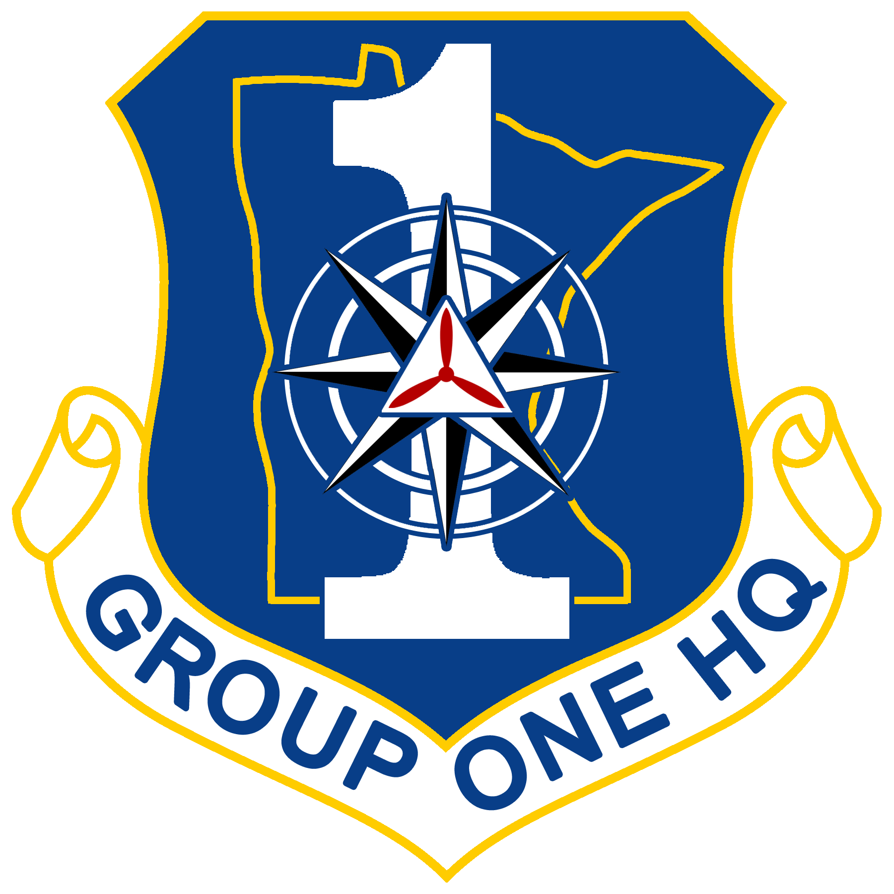
1. Formal description of Unit Emblem
a. Ultramarine background, the outline of the Great State of Minnesota in yellow.
Below it, the number "1" in white. Superimposed over the top of the number 1, is a black and white compass rose, and superimposed over that is the CAP tri-prop logo. The scroll beneath reads, "GROUP ONE HQ."
b. The blue field represents both the lakes of our home state, and the sky that we fly in to achieve our missions. The number "1" representing our Group and is placed In the center of the patch. The compass rose is superimposed over the number signifying the job of Group Headquarters, to provide guidance and direction to the Squadrons in its charge. The CAP tri-prop logo is superimposed over the center of the compass rose representing the center of our guidance, the CAP mission.
c. Design and graphic by TSgt Douglas Mitchell, Group 1 NCO Advisor
Approved by GRP1 CC, Lt Col Jason W, Suby - September 4, 2021
Approved by MNWG CC, Col Bill Hienz - October 6, 2021
Approved by NCR CC, Col John R. O'Neill - October 26, 2021
Information provided by:
TSgt Douglas Mitchell, Group 1 NCO Advisor
September 4, 2021

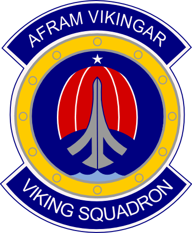 Emblem Heraldry
1. The patch is a circle as required for squadron patches and has an upper and a lower tab as provided for by AFI 84-105.
2. The lower tab (required for the unit name) depicts the words "Viking Squadron".
3. The upper tab (required for a unit motto) contains the words "Afram Vikingar" [all three letters "a" are pronounced as in "car", the letters "i" in "Vikingar" as in "it"; both words are pronounced as "ahf-rahm vick-ing-ahr"]. This is Old Norse for "Forward [or Onward] Vikings!".
4. The patch, as contained inside the circle, depicts a wooden Viking shield, surrounded by bronze rivets, on which a Viking ship is sailing towards the North Star, symbolic of Minnesota's state motto "L'etoile du nord" (The Star of the North). The ship is also a stylized airplane illustrating our missions, particularly as it relates to ES and AE.
5. The sail is segregated into three sections indicative of our three core missions of cadet program, aerospace education, and emergency services.
6. There are 12 "billets" in the shield which correspond to the positions of every hour on a clock face denoting that we are always available and reminding us that timeliness is of great consequence in our SAR missions.
7. The colors, following heraldic principles laid out in AFI 84-105, have the following meanings:
a. The red color of the sail symbolizes courage, patriotism, and passion (for our mission) all of which we encourage in our members. [Yarn: 67154 - Scarlet or Torch Red]
b. The yellow used in the shield encircles everything, indicating excellence (in all we do), honor, and loyalty. [Yarn: 67103 - Air Force Yellow]
c. The dark blue of the sky background and tabs indicates night, i.e. the time we are most often called to perform a SAR mission. [Yarn: 67118 - Ultramarine]
d. The light blue is used to depict water of the "Land of 10,000 Lakes". [Yarn: 67117 - Bluebird]
e. The white border and letters symbolize purity (our cadets), truth, and wisdom towards which we strive. [Yarn: 67101 - White]
f. The gray/silver of the ship hull/airplane connotes discretion, humility, and retrospection, again attributes we are seeking to achieve. [Yarn: 67137 - Gray Silver]
The emblem was designed by squadron member Major Jared Scribner, and approved by Squadron Commander Lieutenant Colonel Brent E Halweg on 09 June 2010. The emblem design was authorized as a wearable uniform patch by Minnesota Wing Commander Colonel Thomas B Theis on 15 June 2010. [Document]
A series of Challenge Coins featuring the emblem have been produced over the years. [Document]
Information provided by:
Lt Col Barney U Uhlig
October 13, 2010
Capt Erik J Lindquist, MN-030 Unit Historian
October 8, 2019

 ELEMENT ONE
Hawk - The hawk faces the position of honor and the direction of progress. Gold is the color of wisdom, representing the continuing education and training our members have dedicated themselves to.
Polaris - The North Star, a symbol of our state and represents the Minnesota Wing. Red is the color of sacrifice, representing the volunteer efforts of our members and their commitment to Civil Air Patrol's missions.
ELEMENT TWO
Right Wing - Represents our squadron's Senior Member leadership.
Left Wing - Represents our squadron's Cadet Member corps.
The wings are upswept and in motion, always working together toward a common goal.
ELEMENT THREE
CAP logo - It is the basic emblem of the Civil Air Patrol and is easily identifiable by all. Together the red, white, and blue represent patriotism and support of our great nation.
SHAPE & FIELD
Emblems representing a Squadron-level echelon of the Civil Air Patrol are contained in a disk shape. Blue and Yellow are the colors of the US Air Force, representing our relationship with and support of the branch as their only official auxiliary. The blue represents the sky, the primary theater of operations, while yellow represents the sun and the excellence required of all personnel. The red in
the rocker represents the boldness of our squadron and its passion for service.
Concept by: Cap Robert Goodman, Sq/CC and 2d Lt Robert Sundheim, Sq/DC
Design by: Maj Ace Browning, Minnesota Wing
Approved by:
- Capt Robert Goodman, Skyhawk Composite Squadron Commander - February 2, 2022
- Maj David Sublette, Group 3 Commander - February 7, 2022
- Col Bill Hienz, Minnesota Wing Commander - March 5, 2022
- Col John R. O'Neill, North Central Region Commander - April 23, 2022

E-mails from the Commander
--------------------------------------------------------
From: William Craig
Date: Fri, Aug 18, 2017 at 1:34 PM
Subject: Squadron Patch & Motto
St Paul Composite Members,
As promised at the last night, I am distributing information about the squadron patch & motto effort, with the goal of inspiring more creativity and additional options for the squadron to consider. If consensus develops quickly around an idea, we'll move quickly to seek Wing approval; if there is a lack of consensus, we will slow the process slightly and develop more options and/or refine the ones we have until we have consensus.
Please review the attached memo. If, after reading it, you would like to submit a different idea or proposal for the squadron memo or patch, please send me your ideas via email, or bring to next week's meeting. If you have an idea but need more time than a week to develop it, let me know soon so we can give you a reasonable amount of time to flesh it out.
One proposed motto/patch option is included in the memo. I welcome feedback on that concept.
Semper Vigilans!
Maj Will Craig, CAP
St Paul Composite Squadron Commander
Civil Air Patrol, U.S. Air Force Auxiliary
--------------------------------------------------------
From: William Craig
Date: Sat, Aug 19, 2017 at 5:07 PM
Subject: Re: Squadron Patch & Motto
St Paul Composite Members,
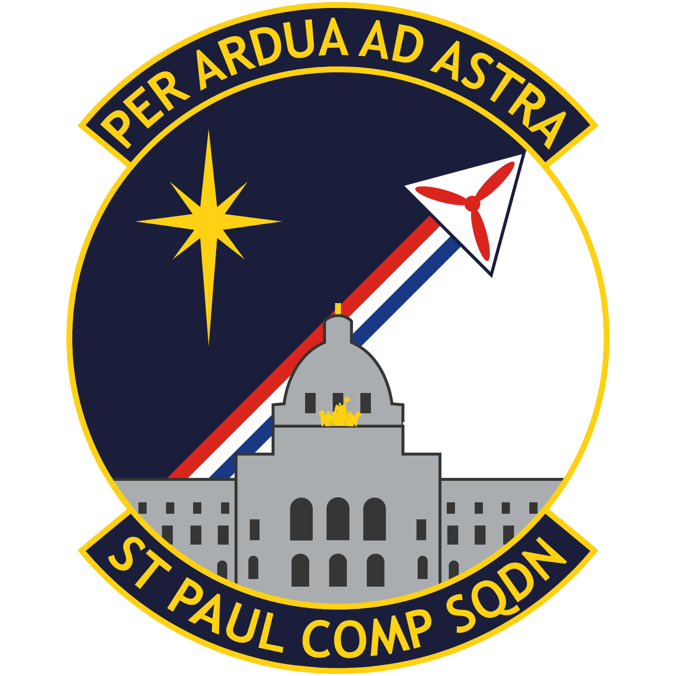
I am excited to share this patch design proposal submitted by C/MSgt Yau for your consideration:
With some minor tweaking on the color selection, it should be fully compliant with CAP and USAF heraldry requirements.
According to Sgt Yau, "Per ardua ad astra is latin for 'Through adversity to the stars', representing the hard and excellent work that members of CAP do in service of their community, state, and nation." Several Air Forces around the world use this as their motto, including the Royal Air Force. The CAP corporate logo has been modified and moved to the right to represent CAP, flying high and towards the stars while being trailed by the national colors. This logo and trail combo allows for a color transition between night and day as to display the north star with more contrast on the left.
I am excited to see other ideas, but I will say that I greatly prefer this design over (my) design shared on Friday.
Please send me your comments and ideas.
We will discuss this as a squadron and see whether we have a consensus on patch & motto selection at Thursday's meeting.
Semper Vigilans!
Maj Will Craig, CAP
St Paul Composite Squadron Commander
Civil Air Patrol, U.S. Air Force Auxiliary
--------------------------------------------------------


Cadet Andrew Browning, with help from highschool friend Jerusha Dose, designed the Rochester Squadron patch in November 1991. The colors used in the design mirror those of the Minnesota Wing shoulder patch. The shield shape is the same as the Minnesota Wing Cadet Encampment pocket patch being used during the same time frame, and a common shape of many United States Air Force emblems.
The design was approved by Rochester Squadron Commander, Captain James "Jay" Liedl, and authorized for wear by Colonel Dennis Rock, the Minnesota Wing Commander.
In 1999 following the renaming of the unit to Southeast Minnesota Composite Squadron, the squadron commander (1st Lt Rebb ????) asked the original patch designer - now Captain Browning of Red Wing Composite Squadron - to help modify the original design. A variation of this design was approved by Minnesota Wing Commander Colonel Kevin Sliwinski and Version 2 began being used in 2000.
Information provided by:
Major Ace Browning

 ELEMENT ONE
White Dragon - The White Dragon, a symbol of the squadron since 1991, faces the position of honor and the direction of progress. White represents the purity of the squadron's Cadet Program and the transformation of youth into dynamic Americans and aerospace leaders. The Dragon's wings are poised showing the squadron's readiness and commitment to be available when the community requires. The four scales on the Dragon's breast and near its heart represent the values of Integrity, Volunteer Service, Excellence, and Respect, that serve as the ethical framework for Civil Air Patrol's service to America.
Red Eye - The Dragon's Red Eye reflects the Red Star below, showing the squadron is Always Vigilant. The red in both represents the boldness of the squadron and its passion for service.
ELEMENT TWO
Map of Minnesota - This is a homage to the Minnesota Wing emblem. Gold is the color of wisdom, representing the continuing education and training which our members have dedicated themselves to.
Red Star - Identifies the location of the squadron's headquarters in Rochester, Minnesota, and the points of the star represent the surrounding communities in Southeast Minnesota where squadron members come from. The Dragon protectively surrounds this area on the map with its tail.
ELEMENT THREE
CAP Charge - The "tri-blade" is a historic symbol of the Civil Air Patrol and is easily identifiable by all. Together the red, white, and blue field behind it represent the squadron's patriotism and support of our great nation. The Dragon displays this symbol with pride.
SHAPE & FIELD
Emblems representing a Squadron-level echelon of the Civil Air Patrol are contained in a disk shape. Blue and Yellow are the colors of the US Air Force, representing our relationship with, and support of the branch as their only official auxiliary. The blue represents the sky, the primary theater of operations, while yellow represents the sun and the excellence required of all personnel. "Respira Ignem" is a Latin phrase meaning Breathe Fire. A squadron member who breathes fire is one that is assertive, motivated, and leads by example. The squadron's motto reminds members to always do your best and give maximum effort.
The emblem was designed by Major Ace Browning, Heraldry Task Force, Minnesota Wing. It was approved by Captain Anthony Knauer, Commander, Southeast Minnesota Comp Sq; Major Jeffrey J Rezac, Commander, Group Four; and Colonel Bill Hienz, Commander, Minnesota Wing. The emblem was authorized by Colonel John R O'Neill, Commander, North Central Region on November 19, 2023.

 Shield: "That Others" is written on the top and "May Live" is written on the bottom of the shield. The sword is angled to the right and is crossed over the motto Semper Vigilans. A black star is fitted into the top of the X of the sword and motto. The banner under the shield is the name of the squadron - 048th Composite Squadron - in Mankato, Minnesota.
Symbolism: Colors of the squadron: White represents peace and sincerity. Red represents military fortitude and magnanimity. Blue represents loyalty and truth. Semper Vigilans - Always Alert, always ready to answer the call for service. The sword represents one's ability to respond to a situation. The star represents guidance in our missions in Civil Air Patrol.
The emblem was designed in 2003 by Cadet Nash Pherson, and approved by the Squadron Commander, Captain John E Barsness. It was approved as a wearable patch by Minnesota Wing Commander, Colonel Dale E Hoium on January 25, 2004. Over six years later the emblem was revived by current Squadron Commander, Captain JoEllen Peters, and patches were produced for the first time in April 2010.
Information provided by:
Captain JoEllen Peters, MN-048 Commander
May 11, 2010

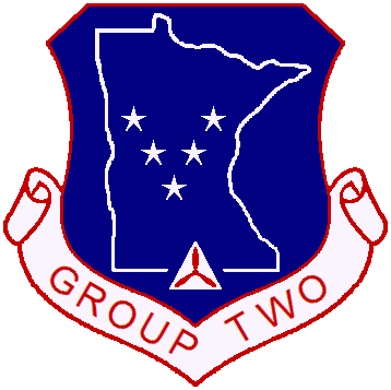
The shield shape of the emblem represents the traditional shape as is required for Air Force unit levels of Group and higher.
The blue background of the shield has a dual meaning. It represents the sky, which was the primary theater of operations when Civil Air Patrol was established. It also signifies that all five units of Group Two are flying units and have aircraft assigned.
Within the field of the blue is the white map outline of the State of Minnesota, symbolizing the Wing we are part of.
Within the map outline of the state are stars that are aligned in a 'V' that represent each Squadron that is a part of Group Two. Those units are Anoka, Crow Wing, Hutchinson, St. Cloud and Wesota Squadrons.
There is a significant meaning of unity between the Squadrons symbolized by the stars. There are five stars and five Squadrons. The alignment of the stars in a 'V' represents the Roman numeral of five. Each of the stars has five points. These five Squadrons are brought together to become one, the Group. The 'V' alignment also is a symbol for victory. This victory is that over times of adversity, thus a Group Motto has been developed. The Group Motto is as follows: "Continuous Improvement through Goal Setting and Accountability."
The five pointed star symbolizes the five points of the human body. Meaning the Squadron and its accomplishments would not be possible without the members that are a part of it.
The white triangle and red propeller represent the organization we are a part of, Civil Air Patrol, and the three missions. Those missions are Aerospace Education, Cadet Programs and Emergency Services.
The scroll contains the identity of Group Two and represents Group Two Headquarters.
The white of the emblem for the triangle, state map outline, scroll and stars symbolizes the purity of the organization as a whole in all that it does.
The red that outlines the entire emblem and the letters of the scroll is symbolic of strength. Strength is attained through unity when the masses gather as one.
The Group Two emblem also holds historical significance. Parts of the Group Five emblem developed in the early 1970s are incorporated into the new Group Two emblem.
The emblem of Group Two was conceived and designed in May of 2008 by Lieutenant Colonel John Quilling, Group Two Commander; Major Conrad Peterson, Group Two Deputy Commander and Major Andrew 'Ace' Browning of Red Wing Composite Squadron. The emblem design was authorized for wear by Minnesota Wing Commander, Colonel Thomas B Theis on May 31, 2008.
Information provided by:
Major Conrad Peterson, MN-061 Deputy Commander
May 31, 2008

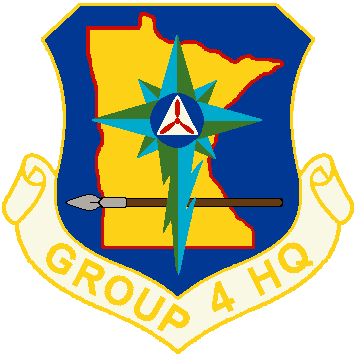 Field
Field
Borders
State Outline
State Background
Compass Rose
Spear
Triangle & Tri-prop Emblem
Scroll and Text
The emblem was designed by Major Jeffrey Bartelt, Group Four Headquarters, and Major Andrew "Ace" Browning, Red Wing Composite Squadron. It was authorized as a wearable patch on January 10, 2010 by Minnesota Wing Commander, Colonel Thomas B Theis.
Information provided by:
Major Jeff Bartelt, MN-063 Commander
January 8, 2010
 "We Are Always Vigilant" - October 22, 1984
Emblem design and heraldry by:
1st Lt Daniel McDowell, MN-065
Drawing (at right) by:
Mike Jacques

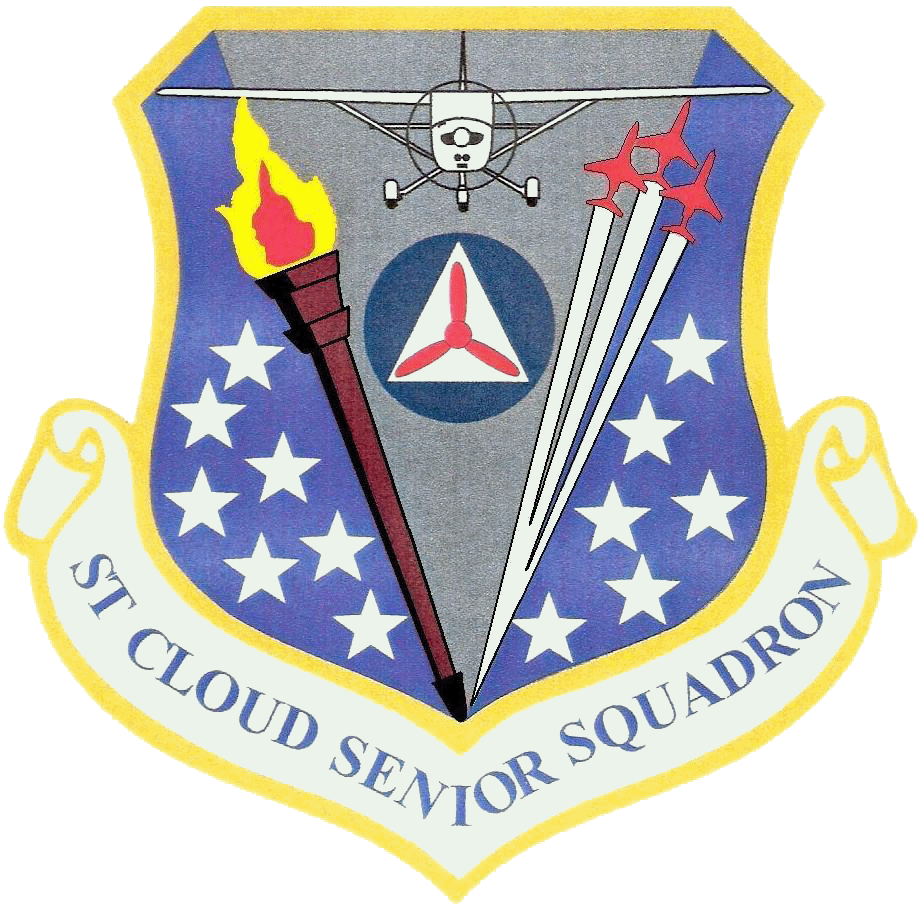
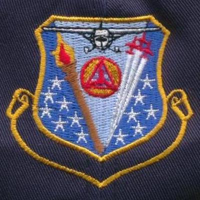 The St Cloud Senior Squadron's emblem was designed by Major Earl W Burress, Jr, in 1997 and was authorized for use as a pocket patch by Minnesota Wing Commander, Colonel Kevin Slywinski. However, the emblem authorized as a pocket patch was only embroidered on baseball caps and polo shirts until the unit merged with MN-116 North Star Cadet Squadron in 2007. A year following the unit's dispersal and over a decade after the patch's authorization, Major Burress had a very limited number of the patches (around 20) manufactured in May 2008 in commemoration of the unit's history.
Information provided by:
Maj Earl W Burress Jr, former MN-094 member
January 25, 2008

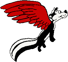
 A patch design contest was held by Red Wing Composite Squadron in 1991, and Cadet Luke Wegner's concept was chosen as the one that most effectivly respresented the unit and its members. The design is simply composed of the unit's full name, the 5-digit unit charter number, a map of Minnesota, and the Civil Air Patrol tri-prop emblem.
The patch's inner componants may be simple, but the bold all-red color and unique wing shape make for an easily recognizable uniform insignia. Similar emblems are common around the city of Red Wing, and internationally known from the Red Wing Shoe Company and highly collectable Red Wing Pottery.
Information provided by:
Maj Ace Browning, MN-104 Historian

Heraldry
"A sable eagle soars vigilant over the azure Mississippi River, banked by amber rocky hills and green lush wooded shores. Its bold red feathers furled in courage, passion, and valor. Flying proud yet humble, the eagle is not alone but part of something greater than itself. The emblem of the Civil Air Patrol ascends high in the sky, a guiding beacon for all to follow, or to find their way. The unit's name and designation blazon gold with excellence, integrity, and honor, is scribed on a red scroll that attributes the sacrifices of all who choose to serve."
Field
Boarders
 Eagle
Eagle
Wings
Rampart walls
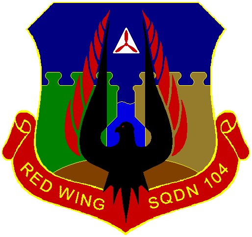 River
River
Triangle and tri-prop emblem
Ground
Scroll and text
History
"Officers in the squadron had decided that a new sign for outside of the Red Wing Civil Air Patrol Center building be made, and a new logo should be incorporated into the design. The logo might also be used in a squadron letterhead, on certificates and awards, and in other uses that the current squadron patch had been being used in years past. The squadron's historian, Major Andrew "Ace" Browning, was tasked with the development of the new logo."
"Designs maintaining the unique and identifiable 'red wing' shape of the original patch were attempted with few results. Captain Luke Wegner, creator of the original patch, suggested using a version of "Hap Arnold" wings, which led to a study of past and present Civil Air Patrol and Air Force emblems. Captain Wegner and Major Browning came up with a crest that was simple, yet descriptive in heraldry. A new unit crest was presented to the staff officers for use on the new building sign, however discussion of the crest quickly turned to adopting it as a new uniform patch for the squadron. Minnesota Wing Commander, Colonel Stephen G Miller, approved the design as a wearable uniform pocket patch on April 17, 2005."
Information provided by:
Maj Ace Browning, MN-104 Historian

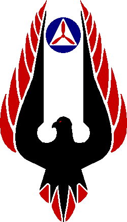
 A Sable eagle soars vigilant over the azure Mississippi River. Its bold red feathers furled in courage, passion, and valor. Flying proud yet humble, the sable eagle is not alone but part of something greater than itself. The emblem of the Civil Air Patrol ascends high in the sky- a guiding beacon for all to follow, or to find their way. The unit's name subscribed on a red scroll that attributes the sacrifices of all who serve.
Borders & Text:
- Colored yellow (gold), representative of the sun and the unit's values including excellence, integrity & honor.
- Same colors of the unit's first and second patches so we do not forget where we have been.
Scrolls:
- Colored red, representative of the volunteerism, dedication and sacrifices of all who choose to serve.
Motto: Stronger as One
- Represents the Cadet's structured program in which they work together to achieve success.
Tri-Prop Emblem:
- Creates a pinnacle above the eagle which stands for strength, courage and freedom.
- Colored red and white which representative of pride in the United States of America.
- Organizational symbol of the Civil Air Patrol-superior air & space power, core values and goodwill ambassadors of the world.
Eagle:
-Colored black (sable), representative of the humility the unit shows in its esprit de corps.
-Symbolic of human flight and the Aerospace Education Mission.
-Literal representation of the rare bird that calls the unit's area it home.
Wings:
-Colored red, representative of the unit member's leadership, passion, and valor.
-Literal representation of the squadron's name "Red Wing".
Bridge:
-Colored silver gray, representative of the connecting of two borders which allow the unit to be "Stronger As One".
-Reflects silver-gray background of the Civil Air Patrol seal.
River:
-Colored light-blue (Azure), representative of the unit's area geography.
-Representative of the unit's Disaster Relief mission, and in support of regular area floods.
Information provided by:
Maj Ace Browning, Southeast Minnesota Comp Sq

 The 40th Anniversary commemorative patch for Red Wing Composite Squadron started off literally as a bar napkin sketch on Friday, September 14, 2007. The squadron was soon going to be celebrating forty years as a chartered Civil Air Patrol unit, starting with a public Open House at their headquarters building on Thursday, September 27. And that would be followed by a Homecoming Party for current and former squadron members on Saturday, October 6. Although unlikely, the goal was to have patches available in time for the Homecoming. Remarkably, the patches were able to start being handed out at the Open House - just 13 days after the rather impulsive project began! The patch was contrived by squadron member, Major Andrew "Ace" Browning.
The "Polecat" has ben a part of Red Wing Squadron culture for over two decades. It originated as an icon of the Black-Cap Emergency Services College, a fun and light-hearted training school developed by the unit to be the "anti-hardcore" contrast to another school who called themselves the "Swamp Rats". A polecat is the swamp rat's natural enemy. Adding "Red Wings" to give the skunk flight seemed like the natural thing to do!
The Roman numeral "XL" translates as "Forty". It can also be read as the word "Excel" which is something that Red Wing Squadron has certainly done over its forty-year existence. The numeral is Ruby Red, which is the precious gemstone that represents a 40th Anniversary.
The green within the disk represents the land and where the squadron has been in the past. The blue within the disk, an Air Force color, represents the sky and where the squadron is going into the future. The red Tri-prop on a white Civil Defense Triangle has been the basic emblem of Civil Air Patrol since its inception. The disk is boardered and segmented in yellow, another Air Force color.
The tabs are comprised of the unit's colors, gold and red. The lower tab contains the Latin words "Semper Bon Tempus", which translates as "Always a Good Time" - the attitude that squadron members carry with them into everything they do.
Information provided by:
Maj Ace Browning, Historian, Red Wing Comp Sq

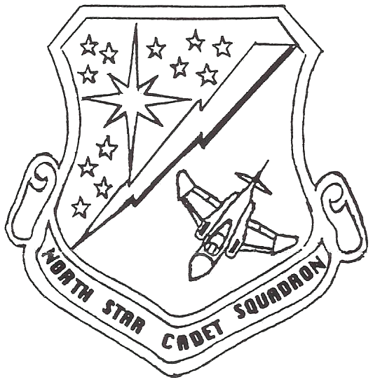 "The North Star Cadet Squadron patch was designed during the spring of 1993 by Senior Flight Officer Earl Burress. The upper left of the patch consists of twelve dim yellow stars and a single bright star on a dark blue background and represents the cadet mission of Civil Air Patrol. The bright star is Polaris, the North Star. Besides representing the name of the squadron, the single star also represents the leadership the young people display as members of the Civil Air Patrol cadet program. The total thirteen stars represent the thirteen original colonies of the United States and North Star's commitment to community and nation. The dark blue background represents the blue of the United States Air Force uniform Civil Air Patrol wears and the ideals that officers wearing that uniform should strive to attain."
"The shield is divided by a stylized thunderbolt. The thunderbolt represents the Emergency Services mission of Civil Air Patrol. This is a symbol of North Star's rapid reaction time and commitment to duty. The red color is in rememberance of Civil Air Patrol members who have lost their lives on both war and peacetime missions."
"The aircraft located in the lower right corner of the shield represents the mission of Aerospace Education. The aircraft is a McDonnell-Douglas F-4 Phantom II. The F-4 served the United States Air Force since the 1960s, was the backbone on the United States military for many years, and will continue to fly in the United States Air Force into the 21st Century. This is why it was selected as the symbol of Minnesota Wing Aerospace by Aerospace Education Officer Dan McDowell. The Phantom requires a two man aircrew to successfully complete its missions. This type of teamwork is also essential to the success of the North Star Cadet Squadron, in the completion of its missions and in the process of preparing tomorrows leaders."
Information provided by:
Northstar Cadet Squadron

 The squadron patch displays a unique symbolism in its design. It symbolizes two squadrons merging into one. With that in mind, certain parts of it will have their roots in the predecessor patches, while other parts will be completely new. Regardless, each part entails a symbolism that defines the heart of Civil Air Patrol.
The Cessna 172 in the center of the patch is what first catches the eye. This came from the Senior Squadron patch and represents the pilots in CAP and the emergency services that they perform. The plane is flying forward, symbolizing the way the squadron is looking ahead to the future, having dreams and working to see them accomplished.
The red lightning bolt represents the quickness with which we respond to emergencies and the safe manner in which we participate in CAP.
The three torches in the top right symbolize the three missions of CAP: Aerospace Education (AE), Emergency Services (ES), and Cadet Programs. The flames represent the youth in the organization and the zeal they have towards reaching their goals.
In the background reside twelve stars surrounding a single star, which represents the North Star. The thirteen stars signify the formation of the original thirteen colonies into a nation, just like the senior and cadet squadrons joined forces to form a more effective, efficient team that will affect the community as never before. The North Star in the center comes from the Cadet Squadron patch. It represents the desire of the new squadron to always be on task, to always be headed in the correct direction.
The black background represents the night sky, deep and mysterious, where minds explore and dreams come true. It represents the eternality of dreams and hope, out of which great things are accomplished. Black also represents prestige. Ours is a unique line of work: entirely professional, yet performed strictly on a volunteer basis.
Lastly, the yellow border represents the peace and happiness that surrounds all that is accomplished as a CAP volunteer, whether a cadet or senior officer.
The St. Cloud Composite Squadron Patch has a rich heritage that is full of meaning. It is a badge of honor, worn with pride by CAP members, and respected by all who come to know it.
Information provided by:
C/CMSgt Jeff Dvorak, MN-116 Cadet Commander
April 2008

Symbolism
The symbol of the Bull: It represents strength, valor and endurance of not only our squadron and its accomplishments, but its dedicated members. It is a reminder to us to continually to always move forward and never falter in our mission. It is also has a representation of or local agricultural industries and the communities for whom we serve in our missions. It is also has a significant historical link to our squadron's past by updating the former symbolism of the "Samurai Cow" and giving us a more modern representation all our squadron members can be proud of.
The symbolism of the Wings: It represents our squadron's long time tradition of aviation excellence, our abilities for aerial search and rescue missions and our undying dedication to the missions of aerospace education.
Phraseology & Motto
The verbiage inscribed upon the patch is most important as for it is our squadron's identifying markers. Our St Croix Squadron name and our Minnesota Wing identifier MN-122 are prominent in their location. Our squadron's motto is inscribed in Latin and states "Nos Simul Superamus" and means "Together We Prevail" - we have kept this motto for it truly reflects our dedication to Civil Air Patrol in Aerospace Education, Cadet Programs & Emergency Services missions.
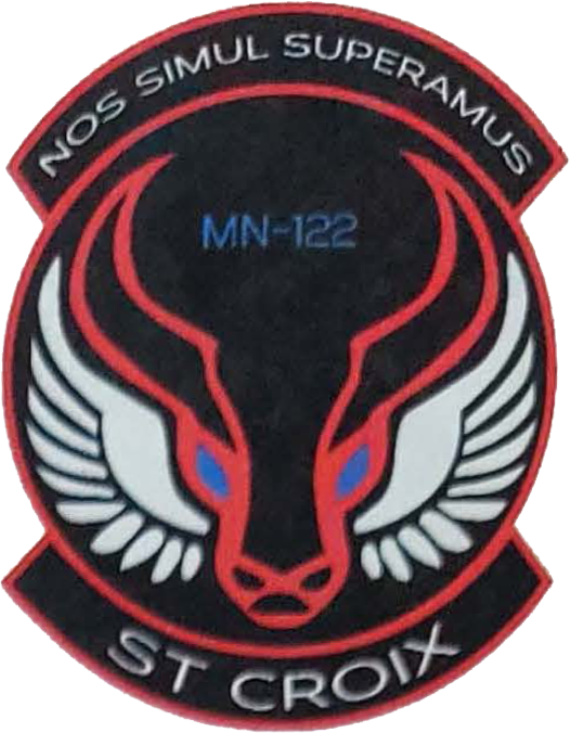 Color representation
RED- Scarlet Red, Yarn Color #67154- out line of disk, rockers and bull
Represents our Courage, Patriotism and Strength in our service
White- Bright White, Yarn Color #76101-Squadron Name & Motto
Represents Purity, Truth and Wisdom in everything we do
Blue- Ultramarine Blue, Yarn Color #67118- Bulls Eyes & Squadron Number
Represents our relationship with the U.S. Air Force, water of the area lakes and the St. Croix river
Silver- Gray Silver, Yarn Color #67137- Wings of Flight
Represents Honor, Integrity & Service before Self
Black- Black, Yarn Color #65018- Disk and Background color
Represents our willingness to be of service to our county & community even in the darkest of nights
The patch was designed by Major Charles Jents, with inspiration from the USAF emblem of 1st Special Operations Civil Engineer Squadron.
Information provided by:
Capt Scott Richardson
April 7, 2014

 BLAZEN
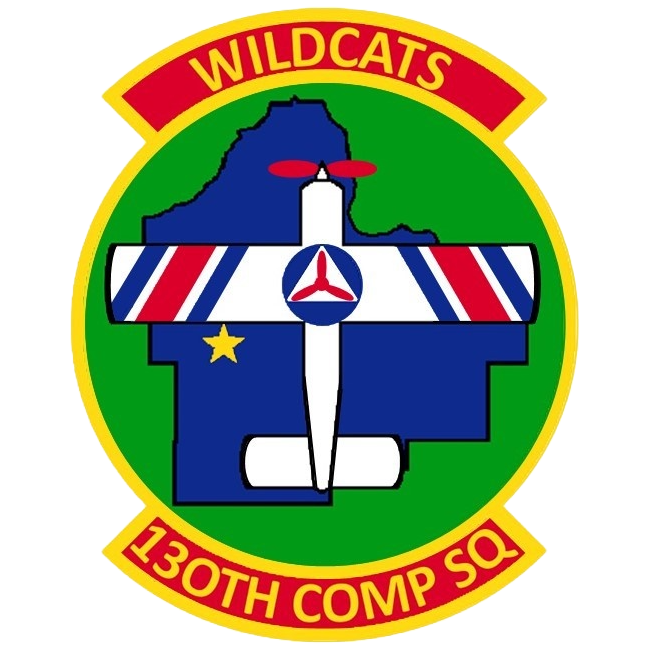
The design field is Vert with scroll field Gules with a bordure Or. An Azure Dakota County with a bordure Sable is center. An Argent (white) with bordure Sable airplane volant over Dakota County with triparted stripes on the sinister and dexter wing. With the center stripe Gules with stripes Azure dexter and sinister of the center stripe. The stripes are angled to intercept in front of the airplane. The center stripe is three times wider than the stripes on its dexter and sinister. Directly below the center of the sinister wing is a mullet Or. In the center of the wings is the Civil Air Patrol roundel.
ELEMENT ONE
Airplane: This represents our squadron's dedication to aerospace. The three red and blue stripes on each of the wings represent the three missions of Civil Air Patrol: emergency services, aerospace education, and cadet programs. The stripes are angled so that they intersect in front of the airplane representing members of Civil Air Patrol and the community uniting together in service. The airplane is facing true north representing our goal to develop cadets with strong moral character as future leaders of the 130th Composite Squadron, our community, state, and nation.
Civil Air Patrol roundel: This represents our squadron's connection to our rich legacy, serving our country in times of great need such as during World War II. The colors red, white, and blue represents the patriotism of Civil Air Patrol members.
ELEMENT TWO
Dakota County, MN: This represents the local communities that the 130th Composite Squadron serves. The airplane placed over Dakota County indicates that the 130th Composite Squadron is ready to serve the community from the ground and in the air. The blue within Dakota County represents water in connection to the name of the city of Lakeville where we are based, and in connection to Minnesota's nickname, "Land of 10,000 Lakes".
Yellow star: This indicates our meeting location within the city limits of Lakeville at Airlake Airport. The yellow and blue represents our relationship to the United States Air Force as part of the Total Force and as their official auxiliary.
SHAPE & FIELD
Emblems representing a squadron-level echelon of the Civil Air Patrol are contained in a disk shape with two rockers located on the top and on the bottom. The top contains either a squadron motto or squadron nickname. The bottom contains the squadron name. The green surrounding the Dakota County element is a representation of greater Minnesota's diverse land features: prairie, farmland, and forest.
--
The emblem was approved by Colonel Bill Hienz, Minnesota Wing Commander on July 23, 2023. It was then authorized for use on July 27, 2023 by Colonel John R O'Neill, North Central Region Commander.
--
Information provided by:
Captian Nancy Zimmer, Commander
130th Composite Squadron
July 12, 2023

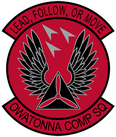 SYMBOLISM
The Owatonna Composite Squadron Disc Design is a re-design of the Squadron�s Shield Design, which was authorized sometime shortly after the Squadron�s charter on 29 October 1996. The slightly simplified elements one and two pay homage to the homage to the organizational roundel most associated with Civil Air Patrol and dates to 1941, to the CAP WWII officer�s service cap device, to the current CAP pilot�s wings, and finally, to the lineage of the Owatonna Composite Squadron. Element three pays homage to Civil Air Patrol missions, as well as to the three (3) T-38 "Talon" aircraft; a well-known Owatonna, MN historical landmark at Owatonna Degner Regional Airport since 2006. The Deltas are in a symmetrical "Vee" formation, pointing to the west at a forty-five (45) degree angle, to face the bearers right. The top scroll contains the Owatonna Composite Squadron motto of LEAD, FOLLOW, OR MOVE. The motto is a modern, abbreviated interpretation of the "LEAD, FOLLOW, OR GET OUT OF THE WAY" Squadron motto in use since the late 1990s, to meet heraldic brevity requirements. The bottom scroll contains the Squadron name, whereas "OWATONNA COMPOSITE SQUADRON" has abbreviated to "OWATONNA COMP SQ" to meet heraldic brevity requirements. The disc is composed of three colors, and all are matched to the Civil Air Patrol colors IAW CAPR 900-2. Their meanings to the emblem are:
- The Pimento Red is an emphasis of the Unit�s bold courage.
- Silver Grey reminds us to proceed with the mature humility of true, professional volunteers.
- Black emphasizes the virtue of consistency in our duties.
DISC
- CAP standardized Squadron disc design
-- 3" diameter disc, filled with Pimento Red (Pantone 200 C) and having an 1/8" black boarder.
Element One
- The silver equilateral triangle contains the triple bladed propeller
-- Equilateral triangle, top point originating from Fess point; lower edge at Base
-- The silver Triangle is represented in a Silver Gray (Pantone 422) overlaid with Black, IAW tincture
-- Silver Gray (Pantone 422) triple bladed propeller, overlaid with Pimento Red (Pantone 200 C), IAW tincture
Element Two
- Two (2) silver, out-spread & up-reaching wings
-- symmetrical wings from dexter & sinister sides of Element 1
-- silver is represented in a Silver Gray (Pantone 422) overlaid with Black, IAW tincture.
Element Three
- Three (3) silver Deltas
-- occupying Chief, Middle chief & Honor point
-- silver is represented in a Silver Gray (Pantone 422)
Scrolls
- The top, centered, 150� arc, contains the Owatonna Composite Squadron motto.
-- Top scrolls extend 1/2" beyond the outer edge of the disc�s boarder
-- filled with Pimento Red (Pantone 200 C) with 1/8" Black borders, and Black, Ariel font lettering.
- The bottom, centered, 150� arc, contains the squadron�s name.
-- Top scrolls extend 1/2" beyond the outer edge of the disc�s boarder
-- filled with Scarlet Red (Pantone 200) with 1/8" black borders, and Black, Ariel font lettering.
The emblem was proposed by 1st Lt Corey J Madrid, Squadron Commander, and received approvals from Maj Keith G Kluzak, Group Four Commander and Col Jason J Suby, Minnesota Wing Commander. The emblem was authorized for use on 21 June 2025 by Col Thomas B Theis, North Central Region Commander.
Information provided by:
MSgt Keith M. Rumler, Squadron Non-Commissioned Officer
January 25, 2025

1. Formal Description of Unit Emblem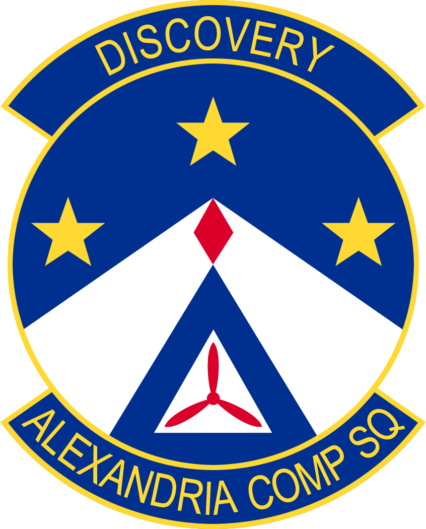 a. Azure (Ultramarine Blue), at honor a fusil gules (Pimento Red), a chevron argent converging to honor, three mullets Or (Air Force Yellow) at chief, dexter, and sinister, at base the Civil Air Patrol Logo Proper, overall bordered in the fourth (Air Force Yellow).
b. Below, a scroll with an abbreviated Unit Name as "ALEXANDRIA COMP SQ"
c. Above, a scroll with the proposed Unit Motto, "DISCOVERY"
2. Symbolism and Significance of Design
a. The blue field, in Ultramarine Blue, represents the sky and waters of Minnesota. If interpreted as the sky, then the Pimento Red fusil (diamond) can be seen as a rocket launching to the stars with all of the hope and guidance promised to our Cadets. The object moves upward in the emblem, pointing invariably toward the star in chief - the North Star - recalling Minnesota's motto as l'etoile du nord, the Star of the North, and representing CAP's role helping those lost by leading them to safety, as Polaris has done for millennia. The three mullets (five pointed stars, in Air Force Yellow) additionally recall the three primary missions of the US Civil Air Patrol and together with the diamond represent the Alexandria Composite Squadron's Unit number, 135 (1 diamond, 3 stars, of 5 points each). At the base is the Civil Air Patrol propeller logo, also traditionally representing the three missions of CAP, but in this context forming the foundation upon which the Alexandria Composite Squadron and our unit mission is
built.
b. DISCOVERY - a single, simple word which evokes in the reader their own interpretations. For the Alexandria Area and West-Central Minnesota, Discovery brings to mind the history of our early ancestors and their voyages of discovery. As a composite squadron of the Civil Air Patrol we encourage our Cadets to discover their own strength in body and of Character and Leadership. We work together to discover the history and sciences of Aerospace and to share these discoveries with the community. Finally, our role of providing Search and Rescue services and our mission to discover those in need of help and to provide what help we can.
3. Designer: 2d Lt Eric Magnuson. Graphic created by Maj Ron Finger.
Information provided by:
Lt Col Blane Pierson, Squadron Commander
April 23, 2021
Ace's Note: The was the first unit emblem in Minnesota Wing to be authorized for use at the region level (Col John R. O'Neill, NCR/CC) in accordance with the new Civil Air Patrol Heraldry Program Regulation 110-3 dated January 25, 2021.

 Design Symbolism
My goal was to create a simple design that was uncomplicated and easy to manufacture. Secondly, I referred to CAP information that I found online that refers to utilizing the USAF Heraldry and suggests criteria for design, size and limiting the colors to 7 or less.
Black: represents solidity, power, formality, and sophistication.
Gold: represents success, achievement and triumph. Gold is the color of the winner.
Sky: represents vastness with no confinement, the ability to go whatever direction and accomplish any goal; whether the goals are set by an individual or by our squadron.
Star: represents the Civil Air Patrol core values.
Red, white and blue flight path: represents our patriotism and love of community, state and nation.
Hawk: is a magnificent, strong creature. Its ability to soar is remarkable. Like the eagle they are strong and powerful - symbols of courage and strength. Hawks have one of the keenest senses of vision and can see fine detail from great altitudes. The hawk symbol gives homage to Stanton Airfield and Stanton Aviation which provides a meeting location and support t o our squadron. Furthermore, the hawk also represents the large soaring community established at Stanton since 1959.
"Nitens In Novam Iuga": Latin for "soaring to new heights". Ties in with the hawk and represents our squadron's potential to achieve great things.
Information provided by:
2d lt Jay A Biggs, MN-136
February 2018
Design approved for uniform wear September 2018 by:
- 1st Lt Jeffrey Rezac, Stanton Composite Squadron Commander
- Lt Col Harry E Coleman, Group IV Commander
- Col James Garlough, Minnesota Wing Comander

At the time the patch was made, there were eight groups in Minnesota Wing. Behind the airplane, there are five stars representing each squadron that was a part of Group Five:
Aeromets and Bryant Squadrons later merged to become Skyhawk Squadron following Group Five's dismantling on April 1, 1979.
Information provided by:
Lt Col John Quilling, Minnesota Wing
July 2008
***Januarry 1942***
71 - Wing HQ, Downtown Holman Field - Lt Col Les Schroeder
711-1 - St Paul - Capt O A Brandt
711-3 - St Paul - 1st Lt J E McGuiligan - All female unit
711-2 - Minneapolis - Capt R Saddigg
711-4 - Robbinsdale - 1st Lt Gordie Lindstrom - 1st Cadet, merged with St Paul 711-1, temporarily Minnepolis Sq, 1952 N Hennepin
712-3 - Minneapolis Sq and University Sq, June 42 - Became Anoka Squadron
713 Group - Southern Group - Capt Harold Schlesselman
714 Group - Central Group - Capt B Vanre
714-1 - Mankato - 1st Lt Rex Hill
714-2 - Worthington - 1st Lt M Watruard
714-3 - Bemidji - 1st Lt Forrest Rising
714-4 - St Cloud - 1st Lt L H Cornelius
715-2 - Alexandria - 1st Lt EM Siemssen
715-4 - Duluth - 1st Lt R L Bloom
715-5 - Grand Rapids - 1st Lt Wayne K Mills
711-5 - University Airport - Capt Orville Hickman - deactivated
711-2 - Minneapolis - Capt R Saddigg - deactivated
712 Group - Northern Group - Capt Miller Witting
712-2B - Willmar - 2nd Lt Frank Pathen - deactivated
712-4 - Minneapolis - 1st Lt B Bloomberg deactivated
713-1 - Albert Lea - 1st Lt O Tuesdell - deactivated
713-2 - Winona - 1st Lt C Venable - deactivated
714-4 - Marshall - 1st Lt George B Ice - deactivated
715-3 - Hibbing, Virginia - 1st Lt R F Davis - deactivated
After 1955, Minnesota Wing charter numbers followed the format of "21xxx", the Xs being the three digits preceeding each unit's name below. That format changed to "MN-xxx" around 1999. The three-digit "squadron number" shown in parenthesis was part of an ongoing attempt in the late 70s and early 80s to realign all the units of Minnesota Wing into as many as six groups. The first digit of the three being the Group Headquarters to which the squadron was assigned at the time.
Charter Numbers known:
000 - Minnesota Wing Headquarters Squadron
001 - Minnesota Wing Headquarters
004 - Congressional Squadron
006 - South St Paul Composite Squadron (401,301), Fleming Field Airport
006 - Dakota Valley
010 - Grand Rapids (101), Grand Rapids
012 - Crow Wing (201), Brainerd
016 - Duluth (102), Duluth
017 - North Hennipen County Composite Squadron (503/303), Crystal
021 - Anoka County (304), Blaine
028 - Group 1
029 - Pipestone (403), Pipestone
030 - Viking (308), Eden Prairie
040 - Skyhawk (306), Rockford (charter renewed December 2020 in Delano)
042 - St Paul (402,302), St Paul
047 - Rochester Composite Squadron (406), Rochester
047 - Southeast Minnesota Composite Squadron, Rochester
048 - Mankato Composite Squadron (407), Mankato
061 - Group 2, Hutchinson
063 - Group 4, Byron
065 - Group 3, Eden Prairie
066 - Bemidji Composite/Senior Squadron (103), Bemidji
066 - Northland Composite Squadron, Bemidji
094 - St Cloud Composite/Senior Squadron (203), St Cloud (dissolved on 02 April 2007 into MN-116)
***c.1967***
104 - Goodhue County Composite Squadron (404), Red Wing (1968)
104 - Red Wing Composite Squadron, Red Wing
104 - Red Wing Flight, Red Wing
113 - Worthington (409), Worthington
114 - Valley Cadet Squadron(509,309), Burnsville
115 - Cass County Senior Squadron (105), Walker
115 - Tri County Senior/Composite Squadron, Walker
***c.1979***
116 - North Star Cadet Squadron (204), St Cloud (merged with MN-094 on 02 April 2007)
116 - St Cloud Composite Squadron, St Cloud (re-designated on 02 April 2007)
119 - Lakes Area Composite Squadron, Detroit Lakes (re-chartered September 2024)
120 - Polar Bear, International Falls
121 - Hutchinson Composite Squadron, Hutchinson
122 - St Croix Composite Squadron, Lake Elmo (moved from Group 3 to Group 2 c.September 2010)
123 - West Metro, 1989-1991
125 - Northfield Flight, 1992
126 - Rum River Composite Squadron, Mora
127 - Marshall Flight
128 - Wesota Composite Squadron, Willmar (dissolved c.September 2010)
129 - Northwest Minnesota Composite Squadron, Thief River Falls
***c.1994***
130 - Farmington Composite Squadron, Farmington
130 - 130th Composite Squadron, Lakeville
131 - Col Cabana Cadet Squadron, Minneapolis
131 - Ft Snelling Cadet Squadron, Minneapolis
132 - Owatonna Composite Squadron, Owatonna
133 - Morrison County Flight, Little Falls
134 - Crookston Composite Squadron, Crookston
***2016***
135 - Alexandria Composite Squadron, Alexandria
***2018***
136 - Stanton Composite Squadron, Stanton
137 - Wright County Flight, Albertville/St Michael
R01 - University of St Thomas, St Paul
R02 - U of M / Duluth AFROTC Squadron, Duluth
R03 - University of Minnesota AFROTC, Minneapolis
Charter Numbers unknown:
Aeromets
Albert Lea
Austin (605,405)
Bearcat (305), Bloomington
Bloomington
Bryant
Detroit Lakes
Fairfax (408)
Fridley (combined with Anoka)
Group 5 (dissolved 01APR79)
Group 6 (dissolved 01APR79)
Little Falls (202)
Mantrap Composite/Senior (106)
New Ulm
St Louis Park (305) (merged with Viking c.1982-83)
South St Paul Composite Squadron (401,301), Flemming Field Airport
Waseca County (601/401)
West Central (205)
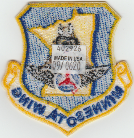
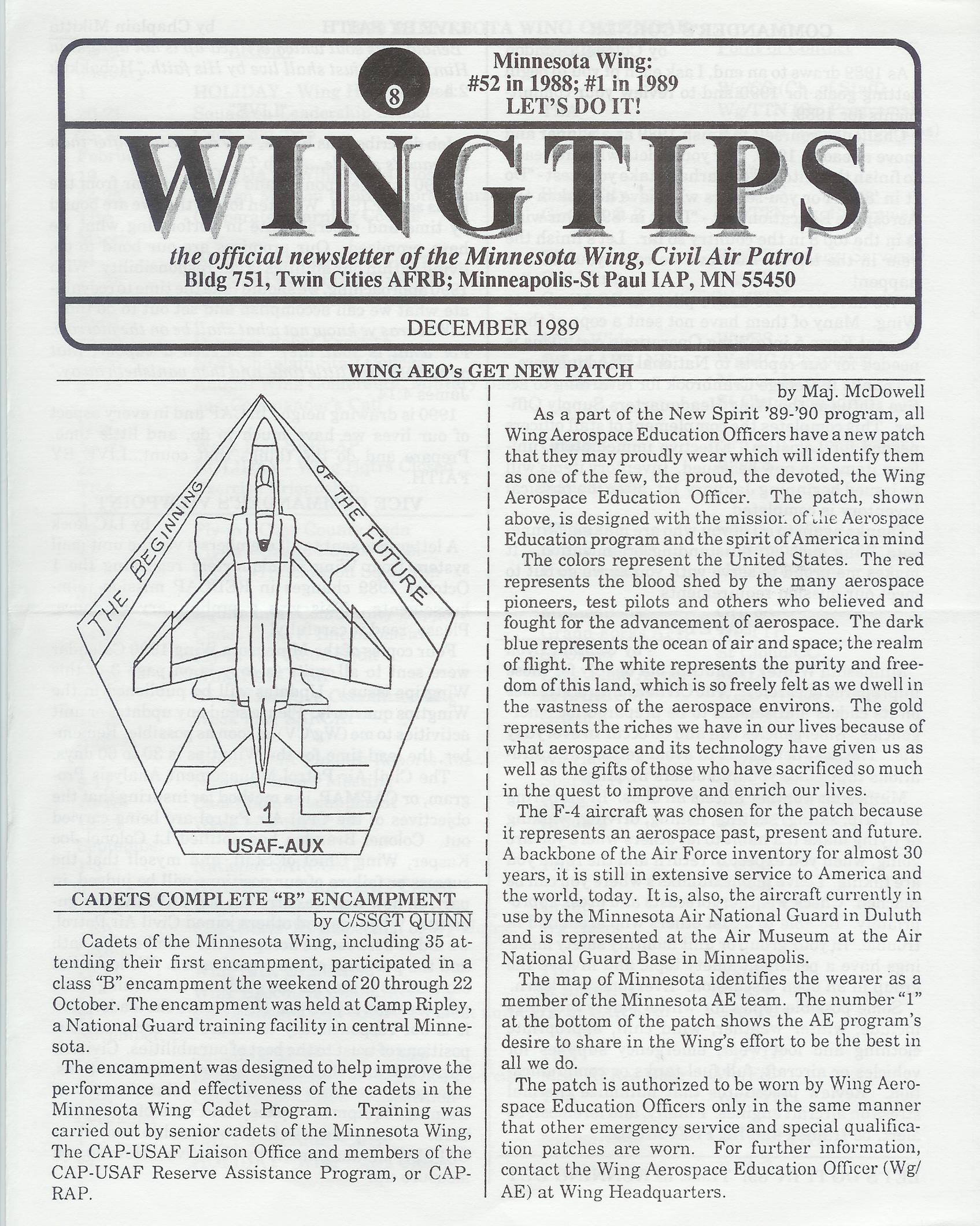