
EMBLEM CHANGE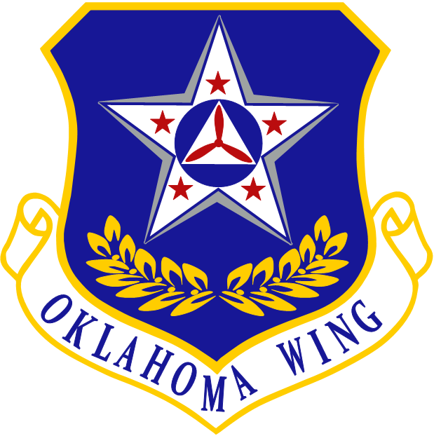 Purpose: To establish and maintain voluntary compliance with USAF heraldic standards for unit emblems as established in AFI 84-105.
Historical Significance: The Oklahoma wing has determined a new wing patch will deliver a message that the Civil Air Patrol (CAP) is still very much a partner in and member of the Air Force total force concept, and as such it is important that we follow its traditions and customs. The Oklahoma Wing emblem remained largely unchanged for over fifty years despite changes to Air Force regulations and standards regarding emblem. By request of the Oklahoma Wing Commander, Colonel Joe Cavett; staff was appointed to design and oversee the development of a new wing emblem that would meet the existing Air Force heraldry requirements, but preserved the heritage and character of the old design as well as captured the spirit of Oklahoma.
Wing Public Affairs Director Captain Rick Rutledge, and Assistant Wing Public Affairs Officer Captain Rob Maucere were tasked with developing several design concepts that reflected many different aspects of Oklahoma, from the state history, to the CAP’s three major missions of which the Oklahoma Wing participates actively in. Presented with five workable concepts; Col Cavett selected 2 that best represented the wing. These designs were distributed to the individual squadron commanders for wing wide input. After the wing had made its voice heard, a final decision was made and the design displayed above was selected to be the new symbol of the Oklahoma Wing.
Heraldry: The components that make up this new design and their symbolism is described below -
Project Commissioner: Colonel Joe H Cavett, Commander, Oklahoma Wing
Project Coordinator: Captain Rick Rutledge, Public Affairs, Oklahoma Wing
Conceptual Design & Art: Capt Rob Maucere, Assistant Public Affairs, Oklahoma Wing
Approved by: Colonel Frank A Bueth, Commander, Southwest Region
Authorized on December 30, 2014 by: Maj Gen Joseph R Vazquez, Commander, Civil Air Patrol
Information provided by:
Commander, Oklahoma Wing, Apr 2011-Apr 2015
July 22, 2024

 Stars
Stars
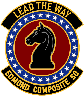
There are 25 stars in this design, representing the first 25 years of service for our unit, the anniversary of which is in May of next year.
Knight
Edmond Composite Squadron is known as the "Black Knights". This stems from two sources. Early in the unit's history, there was a close affiliation with it's cadets and those of the local AFJROTC unit, whose armed drill team is known as the "Blue Knights". In addition, at the time there was a perception that as a new unit, Edmond was considered the black sheep of OKWG. When you combined those, you get "Black Knights". The knight is placed in the "honor" position on the disc (Position G) and faces the bearer's right, or dexter, position.
002
This is our unit number within OKWG.
Colors
Information provided by:
2d Lt Paul Stansberry,
Squadron Deputy Commander for Cadets
July 26, 2016

History
On the 5th of January, 2010, the Oklahoma City Composite squadron initiated a program to align its standards of heraldry with that of the United States Air Force. In doing so, the previous squadron emblem would be replaced with a new design. The design process look approximately four months of planning and collaboration between both cadets and senior members and an additional two months of artwork renderings until a final design was to be submitted for approval. Final design approval was granted from Oklahoma Wing Headquarters on the 8th of August, 2010.
Symbolism Colors
Background
Foreground
Motto
Design Credit
Information provided by:
Captain Rob Maucere, Oklahoma City Comp Sq

 Purpose: To establish and maintain compliance with CAP heraldic standards for unit emblems as established in CAPR 110-3, Civil Air Patrol Heraldry Program.
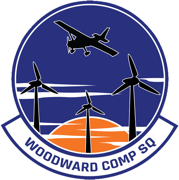
Historical Significance: The Woodward Composite Squadron was initially formed as a flight in 2012 at the Mooreland Airport with three cadets. The squadron began serving the community of Woodward and the surrounding areas of Oklahoma and was eventually given space to take up residence at the High Plains Technology Center.
Heraldry: The components of this new design and their symbolism are described below.
Background: The blue color of the background, with a heraldic name of "Azure," represents loyalty and strength of commitment and ties. The representation of the background denotes a symbolic reference to the Oklahoma skies.
The Stylized Aircraft: The black color of the aircraft, with a heraldic name of "Sable," represents wisdom, constancy and prudence. A direct reference to the squadron’s passion for flight, one of its primary focuses.
The Windmills: Woodward is one of the leading wind converter suppliers for the generation of renewable energy. More than 18,500 installed converters in onshore and offshore applications show Woodward’s competence and experience as a leader in the wind energy business. The emblem was designed with three stylized windmills. The number three has several significant meanings to the squadron. The three windmills represent the three prongs of Civil Air Patrol: Aerospace Education, Emergency Services and the Cadet Programs. The three windmills represent teamwork, one of the foundational principles the squadron was built around. The three windmills serve as a reminder to the rule of three; we should always be looking out for our wingmen.
The Sun: A stylized representation of the sun disappearing below the horizon bringing attention to nature’s vast and majestic palette of artistic color on Woodward’s afternoon horizons. With a heraldic name of "Orange," the color represents determination, strength, and endurance.
The Clouds: The cloud, the symbol of the ethereal heights of heaven, represents the quality of higher truth. The Woodward emblem was designed with not one but two groupings of clouds. The first group, near the bottom of the emblem, is a grouping of four. Bringing together the four Core Values of Civil Air Patrol; Integrity, Volunteer Service, and Excellence, and Respect. The second group of clouds, in the middle of the emblem, is a group of three again bringing more attention to the rule of three and the wingman concept.
Done on this day, the twenty-second day of January, two thousand twenty-two and of the Independence of the United States of America, two hundred and forty-five.
Design and Artwork: Maj. Brandon W. Lunsford, Sr
Reviewed by NHQ Historian Staff: Lt. Col. Timothy Thornton, 20 Aug 2021
Coordinated Through Oklahoma Wing Commander: Col. Aaron E. Oliver, 20 Aug 2021
Approved by Southwest Region Commander: Col Martha C. Morris, 20 Aug 2021
Information provided by:
Oklahoma Wing