

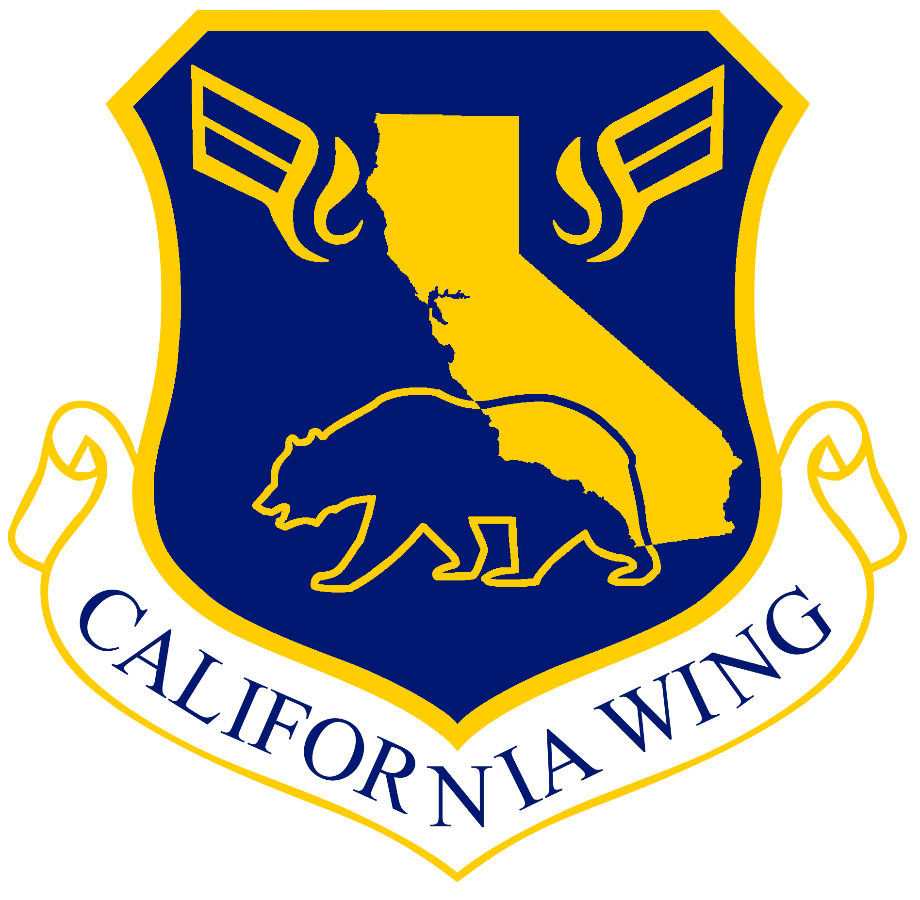
 Symbolism Explanation
California State: The State of California is prominently displayed at the center of the emblem, signifying California Wing’s dedication to the communities we serve.
Grizzly Bear: The California grizzly bear is the official state animal of California and is included in the California State flag, representing strength and independence.
Wings: The stylized wings represent the flying missions of California Wing.
Gold Color (or): The gold color in the emblem represents the history of the State of California, especially the state’s role as the center of the 1850s Gold Rush, as well as the state’s nickname as the Golden State. Gold is one of the two official colors of the State of California under Section 424 of the California Government Code. The particular shade used, Air Force Yellow, has been selected to match the official CAP colors in accordance with paragraph 7.5.4 of CAPR 110-3 and the most recent version of the Civil Air Patrol Brand Guide.
Blue Color (azure): Blue, alongside gold, is the second official color of the State of California under Section 424 of the California Government Code and represents the sky, additionally significant given the nature of our flying missions in California Wing. The particular shade used, Symbol Blue, has been selected to match the official CAP colors in accordance with paragraph 7.5.4 of CAPR 110-3 and the most recent version of the Civil Air Patrol Brand Guide.
The emblem was designed by Captain James Hockel, California Wing; approved by Col Craig Newton, California Wing Commander; and authorized by Maj Gen Edward Phelka, National Commander.
Information provided by:
1st Lt Samantha Moat, Director of Public Affairs, California Wing
February 17, 2024

 According to the traditional "rules" of heraldry, these are the symbolic meanings of the designs on the patch:
The designer was C/MSgt Josiah R Bierle of Skyhawk Composite Squadron 47. The patch was approved February 3, 2014 by Colonel Jim Crum, California Wing Commander.
Information provided by:
Maj James Redmon, Squadron Commander
May 28, 2016
Shortly after moving to San Fernando Airport in 1957, Squadron 35 pilots noticed that whenever they made a take-off run, they could always count on seeing a small flock of roadrunners desperately trying to keep up with the old T-6s through rotation. In spite of repeated failure, they never gave up hope of becoming airborne. Admiration for these stubborn little avians prompted squadron member Bob O'Hara to create a patch utilizing a stylized, aerodynamic roadrunner painted the same colors as the squadron's aircraft. The mountains and cactus in the logo represent the range of the squadron's search activities and its ability to search from the lowest levels of Death Valley to the highest peaks of Mount Whitney, and everything between.
The design caught on and the flightless bird became representative of the squadron's "Never Say Die" attitude. Such was, and is, the spirit behind San Fernando Senior Squadron 35.
Information provided by:
Major Jim Hayden, CAP

The black background was chosen to symbolize the sacrifice and sadness for the loss of several members to duty.
The gold border was chosen to reflect the Squadron's honor.
The red (gules) feathers represents the stnpes in the American flag and traditionally stand for hardiness and valor-strength of mind or spirit that enables a person to encounter danger with firmness.
The white (argent) feathers/stripes represent the second color of the American flag, and traditionally stand for innocence and purity.
The blue leading edge (azure) represents the blue field of the American flag and stands for vigilance, perseverance, and justice.
The American eagle stands for freedom.
The numerals 44 are our squadron number, and identify us from near and far. Diablo Squadron describes the area where our Squadron is located, and refers to Mount Diablo, which is a prominent feature that many of the land surveys of California are based upon.
The white stars represent the thirteen original Colonies that formed the United States.
The words "Mission Spirit" are the Squadron 44 motto, which we hold closest to us as we combine all the elements of this badge. Our sacrifice, honor, valor, purity, vigilance, perseverance, and justice all encompass our Mission Spirit.

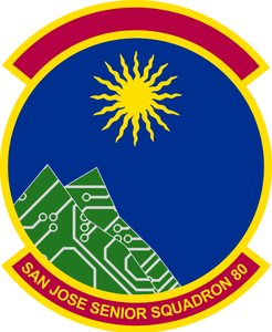
 What's in a picture? If you're an organization, it can define who you are, for better or worse. Making yourself distinguishable, and having pride in that distinguishing factor can be a great morale boost for members of that organization. That is what was mentioned when Squadron 80 decided to update its official emblem as a broader effort to modernize the unit and its headquarters. There were a number of reasons that brought us to this. Our previous emblem, believed to be designed sometime in the early 1980s, had served us well, but did not serve our purposes for a number of reasons.
Thus, our plan was to create a new emblem that was unique, distinctive, identifiable, and symbolic. We wanted those who saw it to be able to see where we are and what we do in it. With these goals in mind, we went to work.
 |
 |
 |
||
 |
 |
 |
Per CAPM 39-1, section 2.8.3, we submitted our design to the California Wing commander on October 11, 2018, and it was approved on October 16, 2018. After approval, we put in an order for patches. Three weeks later, they arrived, and we couldn't be happier with how they turned out. We hope this inspires other units who may have emblems they may find substandard to take a look at their history and create something they can be proud of for many years to come.
The emblem was designed by 1st Lieutenant Isaac Wilson IV, Asst IT Officer; and Captain David Hartman, Squadron Commander.

The patch combines symbols of the Air Force Flight Test Center (AFFTC) emblem with the Mojave Desert area, home of Edwards AFB and Squadron 84. The satellite and diamond pattern come from the AFFTC patch. The Mojave Green rattlesnake and the Joshua Tree refer to the deserts and mountains of the area.

This insignia symbolizes the squadron's collective ideals as a CAP unit. The three silver stars set in a field of midnight blue represent the three missions of CAP. The squadron identifier "101" is formed on a field of sky blue to represent that portion of the aerospace in which we operate. The central digit identifies us as member of CAP by the white triangle and red propeller. The outer digits contain silver missiles in recognition of our host base. The silver lightning bolt signifies our fast reaction to emergencies made possible through CAP communicators. A white scroll containing the unit motto, "Reach for the Stars" (in Latin) completes the design.

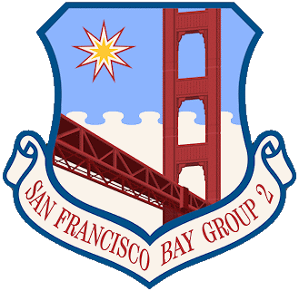 1. Shape. Standard Air Force-styled shield, consistent with group level (and above) organizations.
2. Scroll Text. "San Francisco Bay Group 2" is the name of the organization for which the insignia
stands.
3. 9-pointed Star. The single star represents Group 2 with 9 points representing the 9 squadrons therein. NOTE: This insignia’s star may either remain at 9 points - with respect to the insignia’s historical "original" squadron tally - or flex to reflect a current number of squadrons, per the group commander’s approval. All versions, however, could be honored indefinitely, so as to alleviate financial burdens associated with the recreation of new insignia.
4. Shield. The insignia’s shield is comprised of the iconic Golden Gate Bridge, superimposed upon a serrated sky and fog background.
5. Primary Colors. Ultramarine Blue (RGB:0,81,137 - HTML:#005189), White (RGB:255,255,255 - HTML:#ffffff), Firebrick Red (RGB:255,174,106 - HTML:#b22222), Dark Firebrick Red (RGB:255,196,43 - HTML:#4b0a0a), and Gold (RGB:30,255,154 - HTML:#ffc835).
The patch was designed by Group 2 Headquarters Deputy Commander, Maj Michael "Monty" Montgomery, and approved on March 21, 2008 by Group 2 Headquarters Commander, Maj Kevin J McDowell. The design was authorized by California Wing Commander, Col Kenneth W Parris.
Information provided by:
Major Michael S Montgomery Jr, CAP
Deputy Commander, Group 2 Headquarters

Not much is known regarding the history of my squadron's patch; however, we do know the following information about it...
1. The falcon (embroidered in red) is in honor of the mascot of the U.S. Air Force Academy, as well as in honor of the F-16 "Fighting Falcon" jets of which the United States Air Force Thunderbirds fly.
2. The falcon (embroidered in red) holds three lightning bolts (embroidered in yellow) signifying the three missions of the Civil Air Patrol, namely: Cadet Programs, Emergency Services, and Aerospace Education.
3. The bear (embroidered in yellow) represents the California Grizzly bear found on the California state flag.
4. The state of California (embroidered in yellow) signifies our location.
5. The "l0" (embroidered in yellow) is our squadron's number.
Information provided by:
1st Lt Angelica-Lorraine Lee, Deputy Commander for Cadets
July 8, 2016

Description:
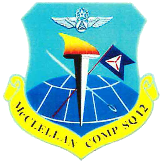
The Squadron 12 patch consists of a military style shield insignia with the figure of a flaming torch superimposed on a crossed saber and guidon. The top of the guidon is to the right, with the saber's point to the left. The saber and torch are silver in color and the guidon staff is gold. The torch represents knowledge and the mission of aerospace education. The torch has twelve individual flames which stand for the numerical designation of the squadron. The saber, a traditional symbol of authority, stands for leadership and the cadet program. The guidon is blue with Civil Air Patrol's traditional three-bladed propeller in the center of a white triangle. The guidon represents the unit's integrity and pride. In the background is a globe depicted in the unit's color, true blue, with lines of latitude and
longitude in white. The globe represents the ground portion of our emergency services mission. The remainder of the background is sky blue and represents the dawning horizons which befall the unit.
 History:
The original emblem was designed by Warrant Officer Marty P. Sanford, Cadet Major Scott E. Bartel, and Cadet Master Sergeant Richard L. Landry in 1974. Col Warren J. Barry, Commander of California Wing, approved the design and gave permission for the adoption of the unit emblem and motto and approved the patch for wear that same year. The patch was first worn in early 1975. The squadron patch is approved for wear, as specified in CAP directives, by all senior members and all cadets who have completed Phase I of the cadet program.
A new version of the McClellan Composite Squadron 12 patch [shown at right] was designed to better represent the new squadron and new missions. This version is very much like the original, but added a set of pilot wings in the sky blue portion of the background to represent the air portion of our emergency services mission. "Continue the March" in the scroll was replaced by "McClellan Comp Sq 12". The final design was achieved by Captain Erin L. Ashby, Captain Brian G. Peck, and 1st Lieutenant Kevin Thompson, with input from all cadet and senior members. The new Squadron 12 emblem design was approved in September 1995, however it is not known if a patch was ever produced. The unit was deactivated in October 2001.

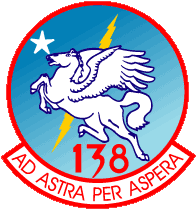 Description
Azure, on an argent wing-horse rampant, before a lightning bolt dexter, an argent star in canton.
Explanation
At the center is Pegasus, the winged horse of Greek mythology, who is believed to have flown up to heaven and taken his place among the stars. The winged horse is also a synthesis of a white mustang, representing Salesian High School, the original home of Salesian Cadet Squadron 138, with the wings of an eagle, symbolic of Eagle Senior Squadron 24, thus visually representing the merger of these two units in January 1980. The lightning bolt connotes power and swiftness. The star in the upper left symbolizes our high goals and aspirations. The colors are also symbolically important. Blue, the color of the sky, represents resolution and determination. The color white represents faith and purity. Yellow denotes honor and loyalty. And the color red stands for courage.
The whole visually reflects and restates the squadron's Laten motto "Ad Astra Per Aspera" - translated into English as "to the stars through adversities."
History
The motto was suggested by 1st Lt Karen Lyon and selected for use by members of the squadron in March 1980. The squadron emblem was designed by then C/TSgt Oscar Garcia and selected by members of the squadron in March 1980. It was approved for use by the California Wing Commander on November 28, 1980.
Information provided by:
Los Angeles Cadet Squadron 138

Symbolic Meanings
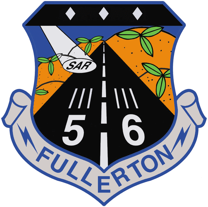
--alternatively--
Information provided by:
Captain Chris R Storey, Public Affairs Officer, Fullerton Comp Sq 56
and Captain Paula Shope, Fullerton Comp Sq 56

The colors were chosen to compliment the BDU uniform rather than stand out.
The knife matches the SERE (Survival, Evasion, Resistance and Escape) patch design.
The three words were the pillars of Skyhawk Composite Squadron 47's training program:
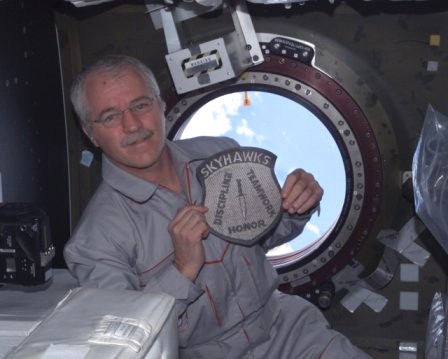 OCEANSIDE, CA -- The Civil Air Patrol, a civilian auxiliary of the United States Air Force, is known for flying to the rescue of lost or stranded hikers, finding downed aircraft, and flying in to aid natural disaster victims, but this time a local squadron is really flying high.
Oceanside CAP Skyhawk Composite Squadron 47 has a friend in high places - NASA Expedition 11 astronaut, Dr. John Phillips (Capt. USNR ret.), Science Officer and Flight Engineer on the International Space Station since April 14, 2005 . Astronaut Phillips is a friend of Major Mike Woods, a Senior Member of Squadron 47. Phillips and Woods were cadets in CAP Squadron 304-C at Williams Air Force Base in Mesa , Arizona during the mid 1960’s. When Woods discovered his friend was going to the ISS, he asked if Astronaut Phillips would do something special to represent Squadron 47 in space.
Phillips had the squadron patch e-mailed to him at the ISS. He enlarged the image, cut it out, had a photo taken of himself with the patch in front of a porthole looking out into space, and then e-mailed the photo back to Major Woods. Voila! Squadron 47 represented in space! Every cadet of Squadron 47 was given a copy of the picture.
Astronaut Phillips is involving the squadron in other ways, also. Each month, several cadets ask questions of him via e-mail and Major Woods then shares the answers he receives. A question posed by 15 year-old Cadet Sergeant Ryan Bucher was, "While in space, what do you miss most, besides your loved ones?" His answer - "I miss just being outside. I also miss cold drinks of all sorts - we don’t have a fridge up here!"
Phillips also sent a photo to the cadets of the San Diego area from 250 plus miles up in space.
On board with Phillips is Russian cosmonaut, Expedition 11 Commander Sergei Krikalev, who, by the time he returns, will have spent 800 days in space, more than any other human being. Phillips and Krikalev are preparing for NASA’s two space shuttles’ "Return to Flight" missions. The space shuttles will rendezvous with the International Space Station. Phillips will do a spacewalk in a Russian spacesuit in August and another in an American spacesuit possibly in September or when the new crew arrives. He is scheduled to return to earth on October 7, 2005.
International Space Station Expedition 11 (April 15, 2005 to October 10, 2005)
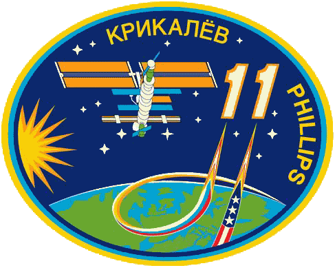 Astronaut John Phillips launched from the Baikonur Cosmodrome in Kazakhstan aboard Soyuz TMA-6, and served as NASA Science Officer and Flight Engineer aboard ISS. During their six-month stay aboard ISS the crew continued station maintenance, worked with scientific experiments, performed a spacewalk in Russian spacesuits from the Pirs Airlock, and hosted the "Return to Flight" visit of the Space Shuttle Discovery (STS-114). The ISS-11 crew landed in Kazakhstan on October 10, 2005. In completing his second mission Phillips logged 179 days and 23 minutes in space including an EVA totaling 4 hours and 58 minutes.
Information provided by:
Skyhawk Composite Squadron 47
July 1, 2005


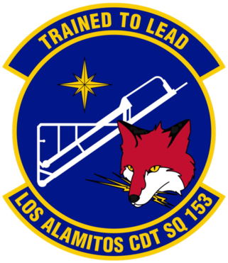 Shape
Shape
Pursuant to guidance of chapter 6 of CAPR 110-3 for squadron emblems, the new design will comprise of a disc containing design elements detailed below, a top scroll with the squadron’s motto, "TRAINED TO LEAD", and a bottom scroll with our squadron name, "LOS ALAMITOS CDT SQ 153" [6.2, 6.4] - not exceeding thirty characters per scroll [6.3].
Colors
The new design will utilize a total of five colors - black, blue, red, white, and gold as outlined in chapter 7.5 of CAPR 110-3, with the overall color of the patch being that of blue which is in keeping with the tradition of our previous patch design:
Information provided by:
Los Alamitos Cadet Squadron 153
January 6, 2025

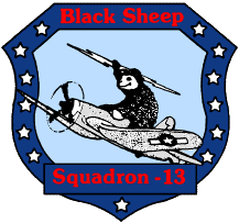
 The unit emblem consists of an Air Force-style crest insignia, with the figure of a black sheep holding a lightening bolt and sitting astride an F4-U Corsair, which is climbing to the left.
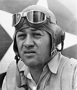
The Corsair was made famous by Marine Corps Colonel Gregory 'Pappy' Boyington (1912-1988) and his Black Sheep Squadron during World War II.
The plane is silver in color and flies with integrity and pride in a sky of light blue.
The surrounding silver stars, which are seen shining on a field of true blue, represent the honor of the country which we serve.
The true blue shield surrounds the enitre patch and our unit's designation, "Black Sheep Squadron" is proudly displayed in warm red.
Information provided by:
Cadet Josh Pavlovich and the Squadron 13
"Unit Standrd Operating Procedures" manual,
February 1996

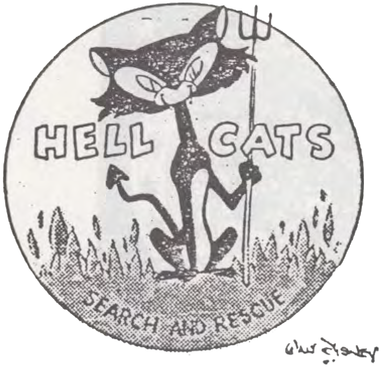 Contact - Aviation's Newsmagazine -- December 1, 1954:
LONG BEACH, Calif. - In the early morning hours of 21 July 1952, an earthquake hit the town of Tehachapi, Calif. Long Beach Group 23 was requested to send CAP personnel to assist in this disaster. Thirteen members of the group reported for duty and worked well over 40 hours with the Marines putting up tents and doing other general duties through-out the town.
The name of "Hell Cats" was given to this rescue team for their work at Tehachapi, and the members decided to depict the name. Subsequently, a request was made to Walt Disney, who drew a patch for that particular team and any new members qualifying to wear the patch in the future. The only way that any person from Group 23 can join the "Hell Cats" is to be on three missions or disasters called by the Air Force, be qualified to hold a valid First Aid card, and be approved by the original members of the team.
[ article clipping ]
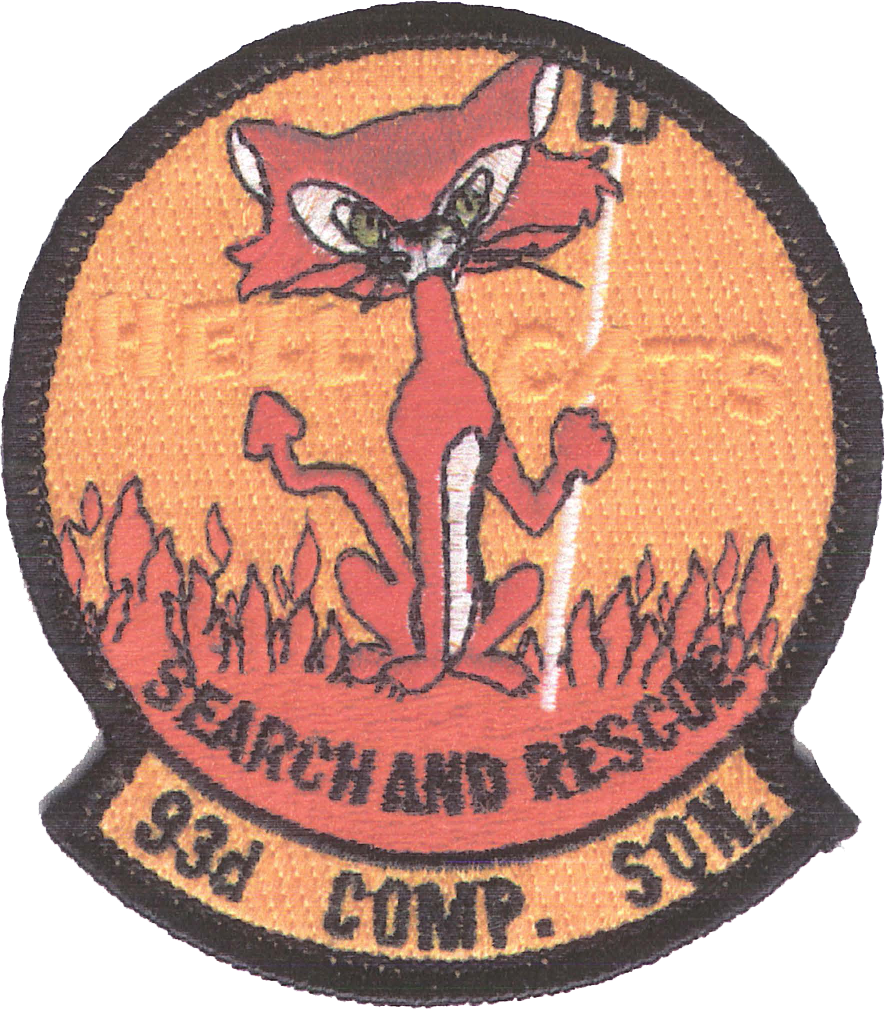 The emblem was later incorporated into a patch used by CA-092 Long Beach Squadron 93, which deactivated in July 1997.
Information provided by:
Lt Col Charles Wiest, CAP
California Wing Historian
2007

The shield shape and the eagle in the upper left quadrant denote our link with the United States Air Force.
The two fields of blue represent the sky, and the fact that two of the four quadrants are blue represents the vastness of the sky. The blue also denotes aerospace.
The red and white checkerboard in the lower right quadrant represents the grids flown during air searches. In the past, the search area was split into red grids and white grids, with each being flown on alternate days. Red also denotes courage.

The patch is symbolic in its use of the Sutter Buttes, which are an important natural and historical landmark in the North Valley. The SR-71 "Blackbird" is unique to Beale AFB and is included in honor of the Air Force Base that supports Squadron 19.

The colors chosen for the patch are red, white, blue and yellow (gold). Each color symbolizes the following: red is for hardiness and courage; blue is for vigilance, courage and justice; these are
divided by a fine white line of purity and innocence. Gold is used to symbolize the value inherent in the unit.
The American bald eagle is the national symbol of the United States and, as such, is incorporated into the design on a field of blue sitting astride the thin white line of purity. The thirteen stars on a blue field symbolize the original thirteen states, a vital part of our American heritage. The numerals "51 " stand for the unit designation. The inscription on the scroll reads "Clover Field Sqdn 51" for the reason that there is not enough room for the entire name of the squadron. "Semper Vigilans" on a field of red is our motto and, as such, is given a prominent place on the shield.
The emblem was designed Colonel Lawrence D Toiga.

Information provided by:
Lieutenant Colonel Lou Lappert, CAP

The three-bladed propeller symbolizes the three missions of Civil Air Patrol. The brown hills represent the Antelope Valley, where the Joshua Tree is abundant. The airplane symbolizes the dedication to aviation.

The subdued patch is authorized by HQ/CAWG for wear by our squadron on BDU's. The full color patches... I'm not totally sure about. They were the first ones made (way before I joined), they happend to have some left, and I bought one. When we had our new batch made - we only had subdued ones made, because we didn't know what to do with full color ones (no one in the squadron deals with A/C's, so that's out).
Also - not sure if I informed you about the history behind it, but the purpose of the "phoenix rising from the ashes" is due to this: There were two distinct squadrons in San Diego (late 80's, early 90's, I believe), and they both lost many members, thus, having to shut down. Our squadron was created after 10 years or so through the combination of the two previous ones (in regards to squadron number), thus, the term: rising from the ashes.
Information provided by:
Alex Ramos
September 17, 2008
--alternatively--
The mythical phoenix is an historical reference to our squadron's history. Squadron 144 was formed several years ago by combining two small squadrons: Brown Field Cadet Squadron 67 (04256) and Golden Eagles Composite Squadron 77 (04441) [144 is the sum of 67 and 77]. The phoenix was chosen to represent the "rebirth" of the units as they merged to become Squadron 144.
The motto translates as "Duty First, Honor Always.
Information provided by:
Captain Chris Van Gorder, CAP
and Captain Daryl Newton, CAP

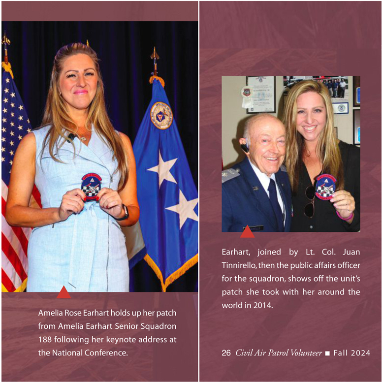

The following is the background and history information about the patch which was provided to us from a former and founding member of our squadron, Captain Allen Graff:

Information provided by:
Capt Kristian P Ticas, Deputy Commander for Cadets
July 10, 2016

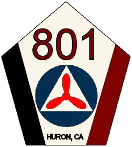
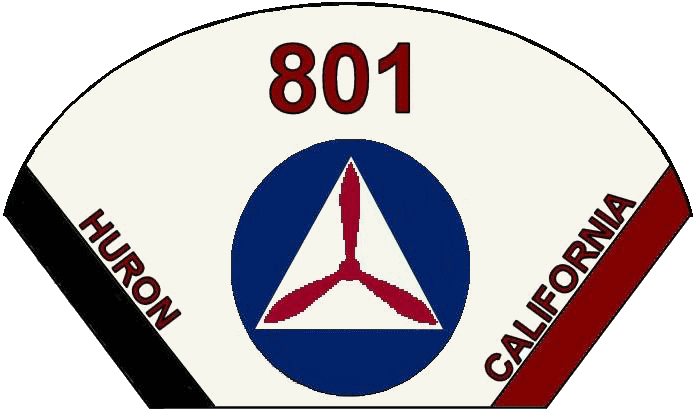
"Our squadron began holding meetings in October 2006, which at that time we were an Airplane Club. Two of our future cadets went on their airplane rides in a Cessna aircraft in November. December saw five of our students marching in the Huron Christmas Parade. We were chartered on 22 February 2007 by the Civil Air Patrol and we became the first School Enrichment Program (SEP) unit in California Wing. Since then we have been very active, from Rocket Days to providing aircraft security in Porterville."
Information provided by:
Jason Pennington, former squadron member
January 2008

Information provided by:
California Aerospace Composite Squadron 802